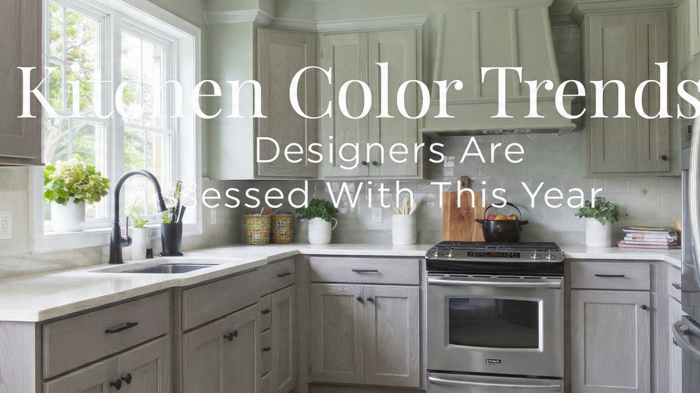
Kitchen Color Trends Designers Are Choosing
I’ve been studying Kitchen Color Trends Designers are using this year, and the shift is very clear. Kitchens are no longer just white or gray boxes. Designers are now focusing on colors that feel personal, emotional, and connected to real daily living.
Above the Fold:
In this article, I break down 17 kitchen color directions I personally see dominating modern homes. These include soft nature-inspired tones like sage green, warm earthy shades like terracotta, and bold choices like inky black and cobalt blue. I also share practical design tips, real-world observations, and how these colors actually behave in real kitchens—not just in photos.
Key Takeaways
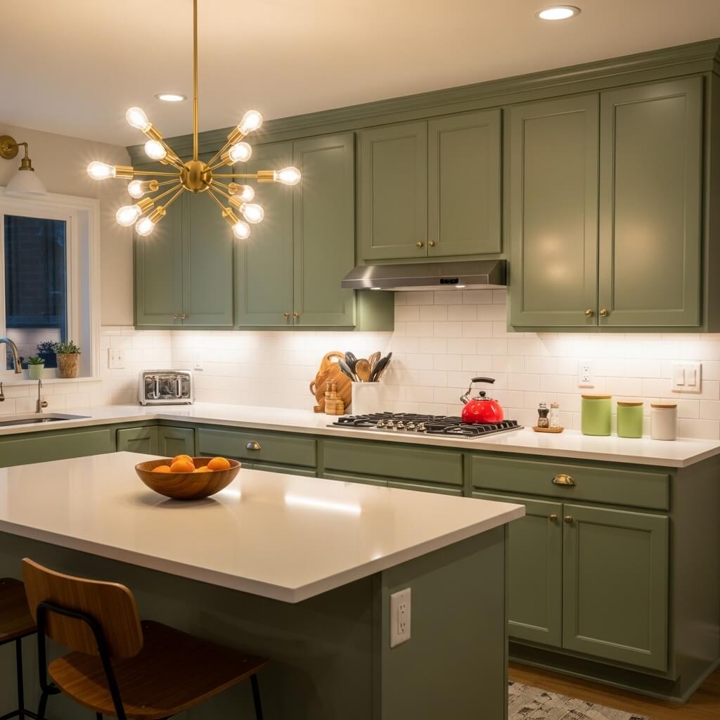
1. Sage Green, The New Neutral
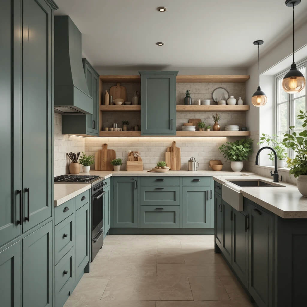
From what I’ve seen in real kitchen projects, sage green has become one of the most trusted modern colors. It feels soft, natural, and easy to live with, which is why designers treat it almost like a neutral.
I often see it paired with wood finishes and matte black hardware to keep the look balanced and modern. It works especially well in kitchens where people want calm and warmth without using plain beige.
Pro Tip: I always test sage green in both daylight and warm lighting because it can shift tone depending on the environment.
2. Bold Charcoal
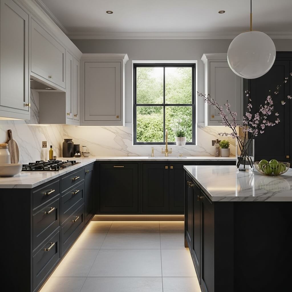
Charcoal is a strong, grounded color that I see used in modern and luxury kitchens. It adds depth and makes lighter materials like marble stand out more clearly.
Designers often use it on lower cabinets only, while keeping upper areas lighter to avoid making the space feel too dark.
Pro Tip: In smaller kitchens, I recommend pairing charcoal with good lighting to keep the space open.
3. Terra Cotta & Warm Clay
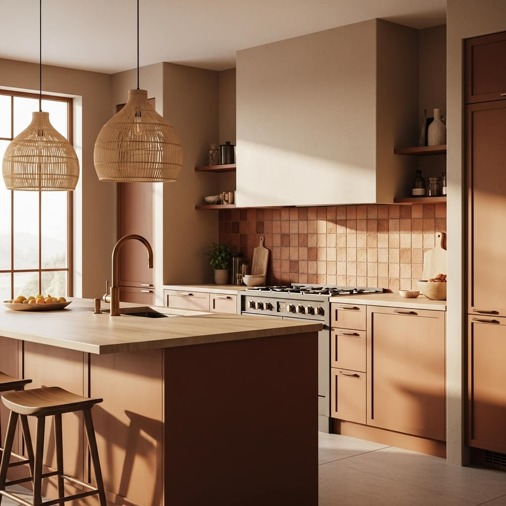
I notice terracotta and clay tones are becoming more popular in kitchens that want a natural and warm feeling. These shades work especially well with stone, wood, and textured surfaces.
Designers often use them in accents instead of full walls to avoid overpowering the space.
Insight: Earth tones like these are strongly linked to biophilic design, which brings nature into interiors.
4. High-Gloss Navy
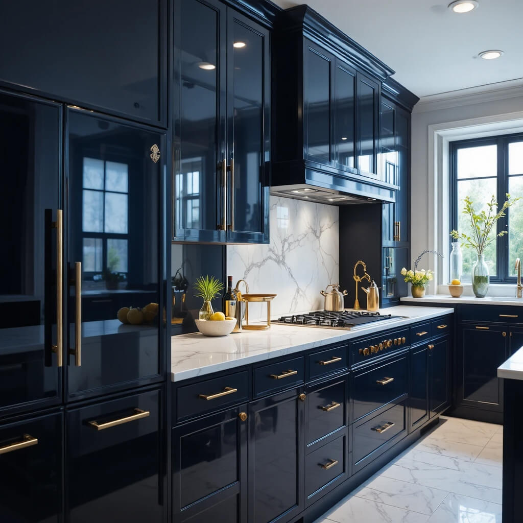
Navy kitchens continue to stay popular, especially in glossy finishes. I’ve seen this color used in both modern apartments and classic homes because it feels rich without being too loud.
The glossy finish helps reflect light, which keeps the space from feeling heavy.
Pro Tip: Gloss finishes look great but require more cleaning because fingerprints show easily.
5. Butter Yellow
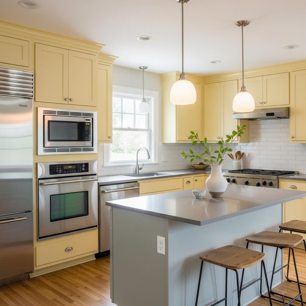
Butter yellow is a soft, warm color that I see used in kitchens that need more natural light. It adds brightness without feeling too strong or overwhelming.
It also works surprisingly well with stainless steel appliances and neutral countertops.
6. Deep, Inky Black
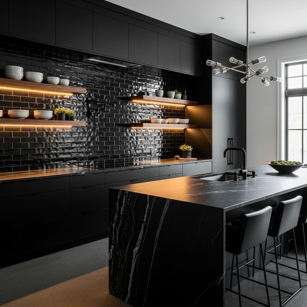
Black kitchens are now a common design choice in modern homes. I see them used when contrast and drama are the main design goals.
Designers balance black with wood, stone, or layered lighting to prevent a flat look.
Pro Tip: Matte black is easier to maintain than glossy black in daily use.
7. Softest Peach
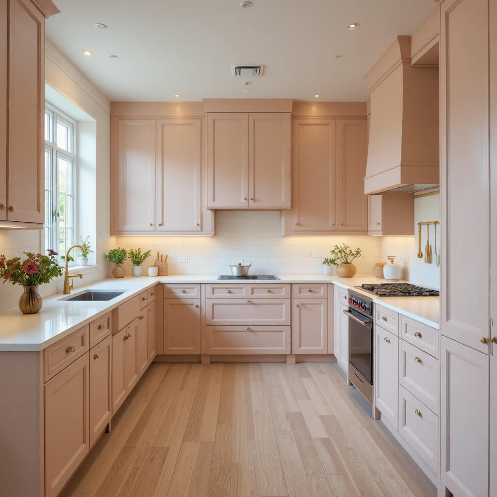
Soft peach is becoming a quiet favorite in modern kitchen design. I notice it used in spaces that want warmth without bold color pressure.
It also reflects light softly, making it ideal for smaller kitchens.
8. Retro Avocado
Avocado green is back, but in a muted and more modern form. I often see it used only on islands or lower cabinets instead of full kitchens.
It adds personality without overpowering the space.
9. Whisper Gray (It’s Still Here!)
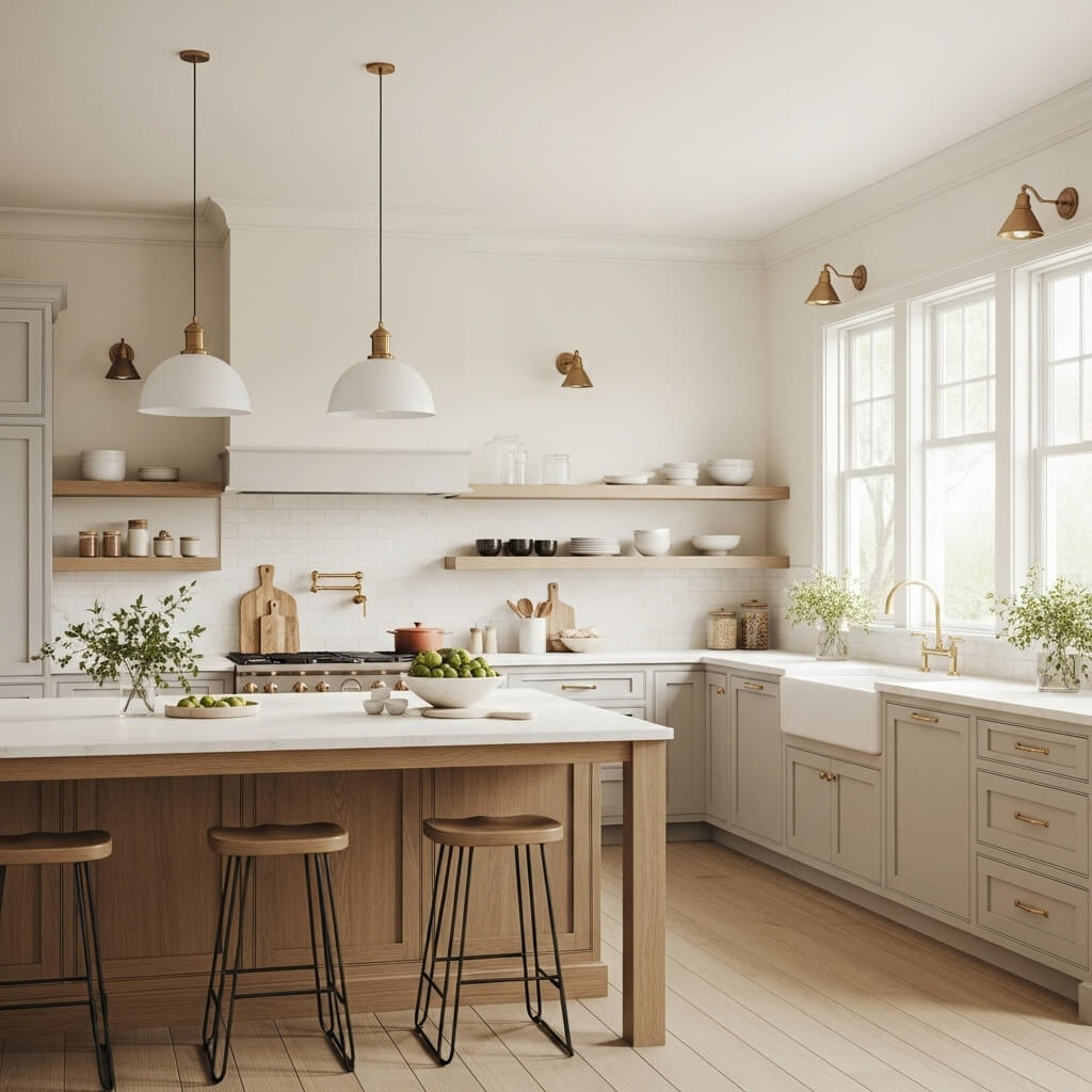
Gray is still relevant, but it has become warmer and lighter. I see designers moving away from cold gray tones toward softer versions.
These shades work as flexible bases for almost any accent color.
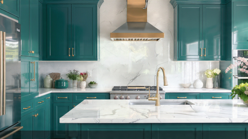
10. Jewel-Tone Teal
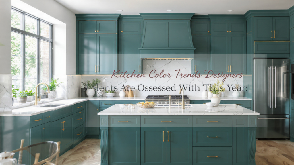
Teal is one of the most striking Kitchen Color Trends Designers are using today. I see it in kitchens that want a mix of luxury and personality.
It pairs especially well with brass and gold finishes.
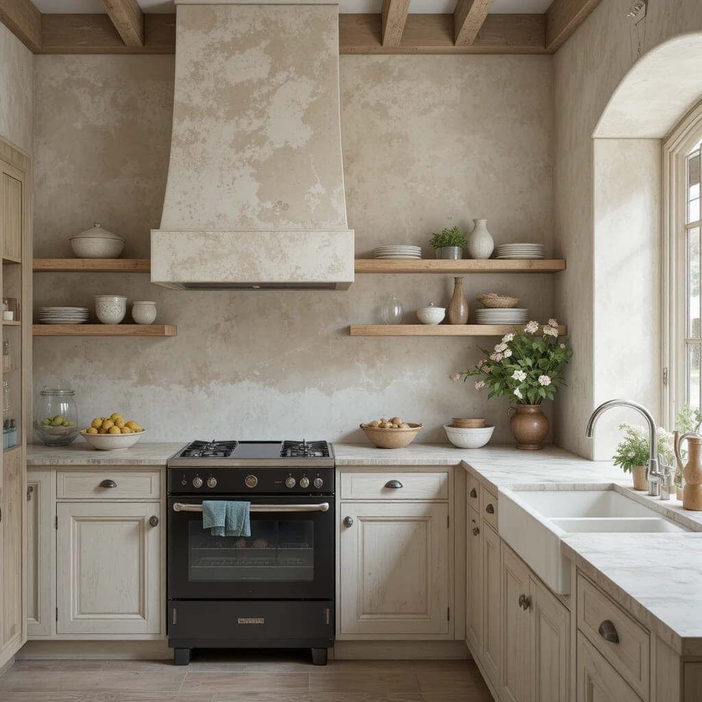
11. Creamy, Warm White
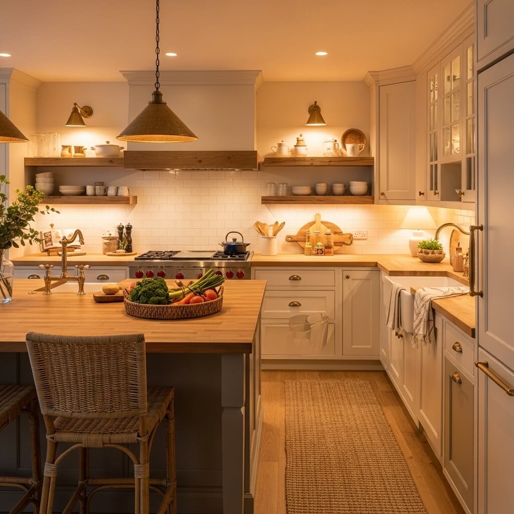
Cold white kitchens are fading. I now see creamy whites used more because they feel softer and more natural in everyday lighting.
Designers prefer whites with warm undertones instead of stark pure white.
Pro Tip: I always test white on large samples because lighting completely changes the result.
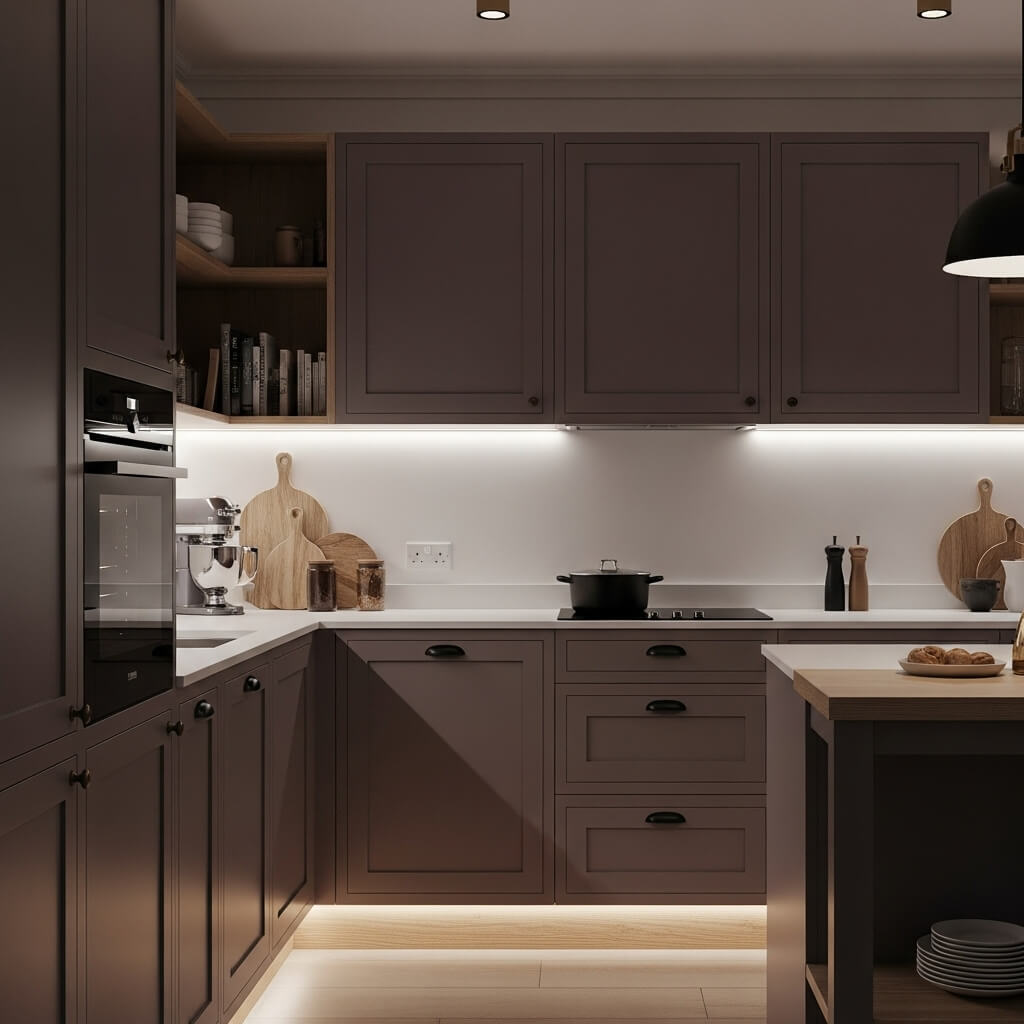
12. Chocolate Brown
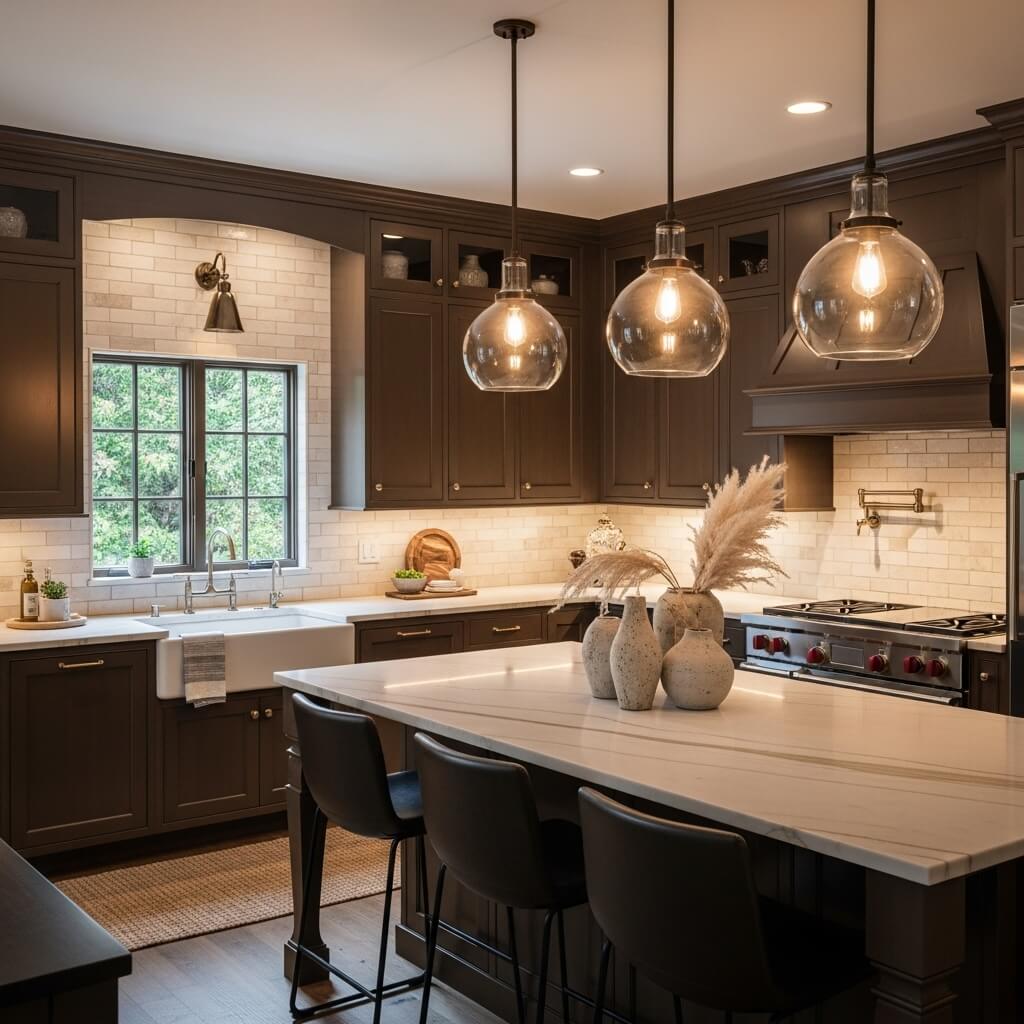
Chocolate brown is returning in modern kitchen design. I see it used to create a grounded, rich atmosphere.
It works especially well with stone countertops and natural textures.
13. Zesty Lime Wash
Lime wash is more about texture than solid color. I notice designers using it to add depth and a handcrafted look.
It gives kitchens a slightly rustic, European-inspired feel.
14. Vibrant Cobalt Blue
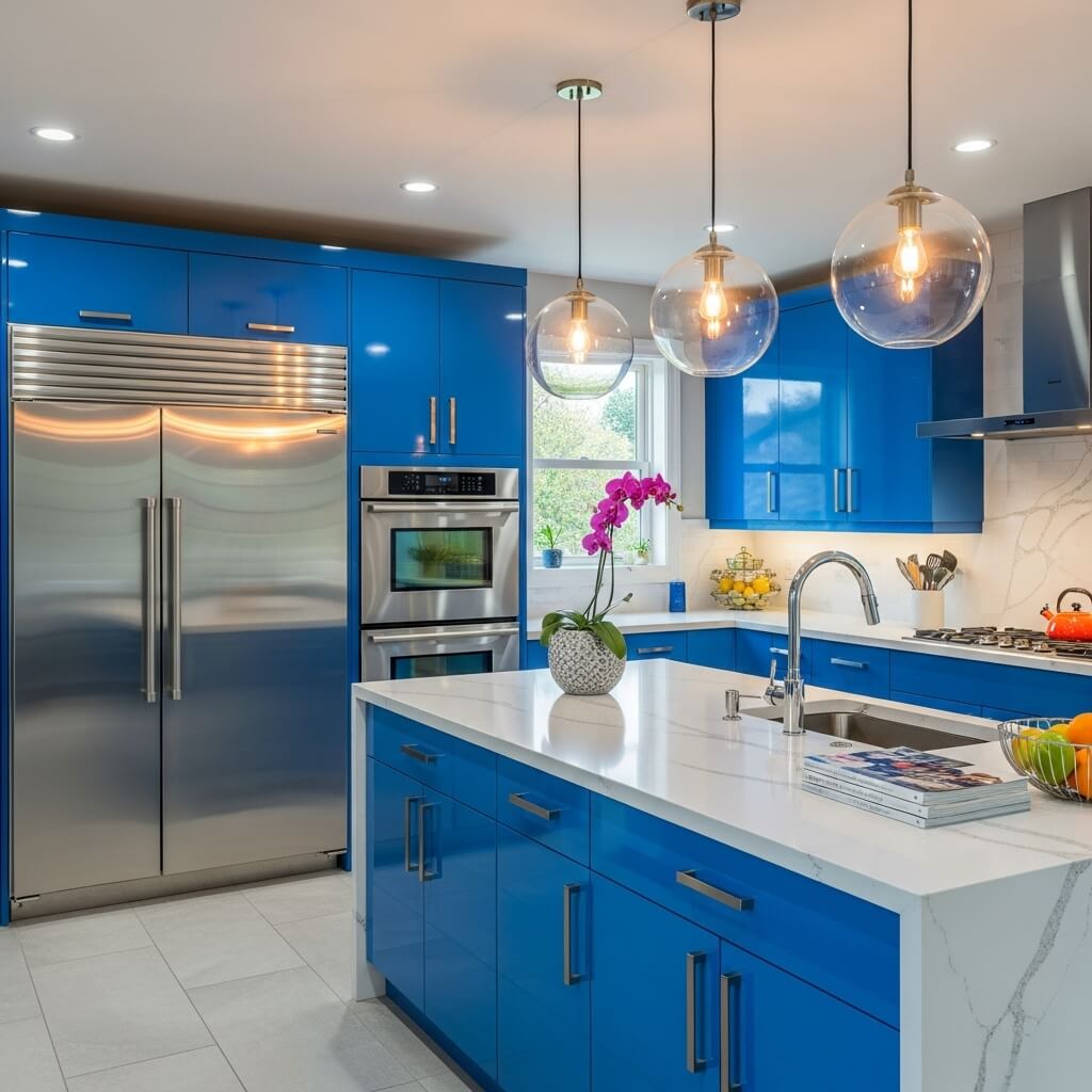
Cobalt blue is a bold and energetic color I see in modern kitchens. It brings strong visual impact without feeling outdated.
It also works very well with stainless steel appliances.
15. Pretty in Plum
Plum tones are becoming a subtle luxury choice. I see them used in kitchens that want elegance with a slightly different edge.
They pair well with wood, brass, and black finishes.
16. Sun-Drenched Ochre
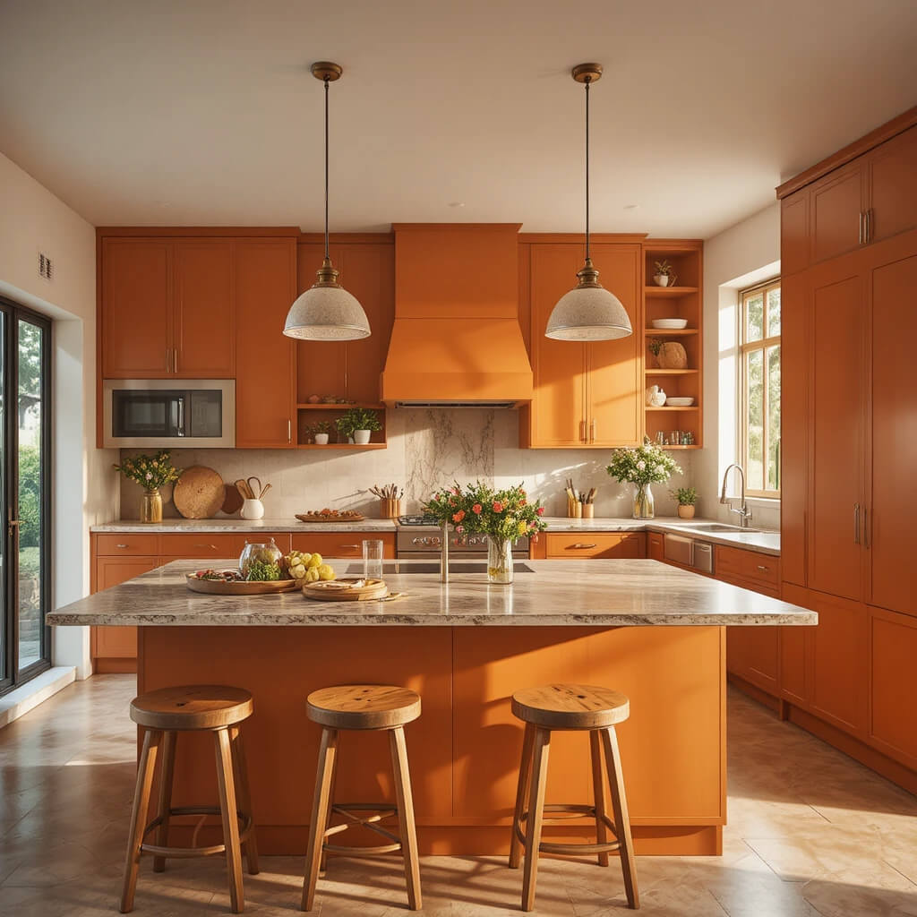
Ochre is a warm golden tone that feels earthy and bold at the same time. I often see it used for kitchen islands or accent walls.
It creates a strong focal point without overwhelming the space.
17. Two-Tone Everything
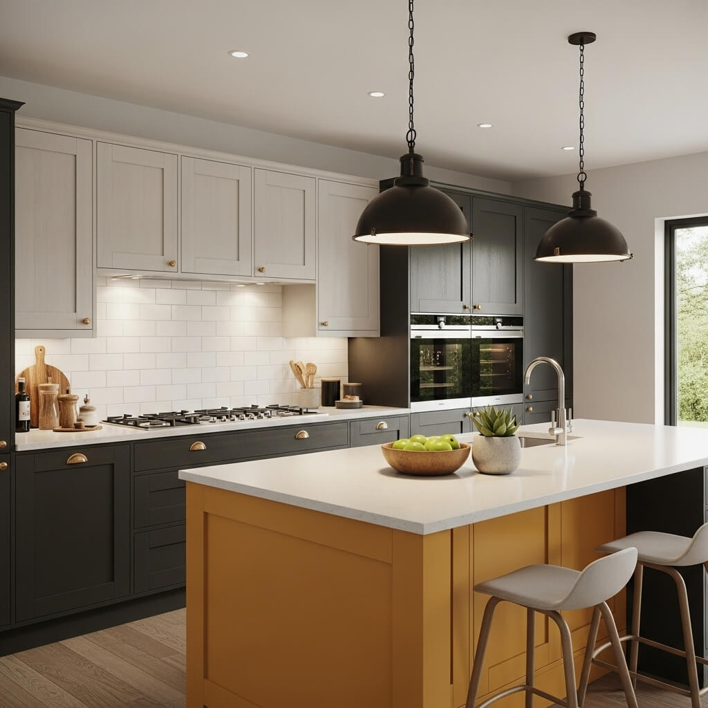
Two-tone kitchens are one of the most practical Kitchen Color Trends Designers are using right now. I see this approach in almost every modern renovation.
It usually combines dark lower cabinets with lighter uppers or a bold island with a neutral base.
Pro Tip: This is the easiest way I know to experiment with color without full commitment.
Your Kitchen, Your Canvas
From my experience, Kitchen Color Trends Designers are no longer about strict rules. They are about personal expression and comfort.
I see more homeowners choosing colors based on feeling rather than tradition. Whether it’s sage green, charcoal, or butter yellow, the goal is always the same: a kitchen that feels natural to live in.
The best results always come when I test colors in real lighting and trust how the space feels during daily use, not just how it looks in design photos.
Conclusion
From my perspective, the biggest lesson in studying Kitchen Color Trends Designers are using in 2026 is simple: there are no fixed rules anymore. Kitchens are no longer designed just to look clean or neutral. They are now built to reflect personality, daily lifestyle, and emotional comfort.
When I look at real projects, I notice designers are becoming more flexible with color than ever before. Some kitchens go soft with sage green or creamy white, while others go bold with charcoal, navy, or even deep black. What matters most is not the color itself, but how it works with lighting, materials, and space size. A color can look completely different in a bright open kitchen compared to a small apartment kitchen, which is why testing is always important in my experience.
I also see a strong shift toward balance. Instead of fully committing to one bold color, many designs now use two-tone layouts. This approach helps control visual weight and keeps the kitchen from feeling overwhelming. For example, darker lower cabinets with lighter uppers create depth without closing the room in. This is one of the most practical design strategies I consistently see working in real homes.
Another important point I’ve learned is that finish matters just as much as color. A navy kitchen in matte finish feels completely different from the same navy in high gloss. Matte feels grounded and modern, while gloss feels brighter and more reflective. Small choices like this can change the entire mood of a kitchen.
What really stands out to me is how emotional kitchen design has become. People are no longer choosing colors just because they are trendy. They are choosing colors that make them feel calm, energized, or comfortable while cooking, eating, and spending time with family. This emotional connection is what makes today’s kitchen color trends so different from past years.
If I had to sum it up, I would say the modern kitchen is now a personal space, not a template. The best results come when I focus less on strict trends and more on how a color feels in real life. Trends will always change, but comfort, usability, and personal connection stay constant.
So whether someone chooses soft neutrals or bold dramatic tones, the real goal remains the same: creating a kitchen that feels natural to live in every single day.
Many of the ideas I share are inspired by real-life experimentation. I often test décor concepts in my own living spaces and explore practical ways they can be applied in everyday homes. I also gather insights from working with homeowners who want to improve the comfort, beauty, and functionality of their spaces.
I share practical ideas for improving living rooms, bedrooms, and overall home aesthetics using simple design principles.
I explore creative ways to upgrade outdoor spaces including patio décor, small backyard styling, and relaxing outdoor setups.
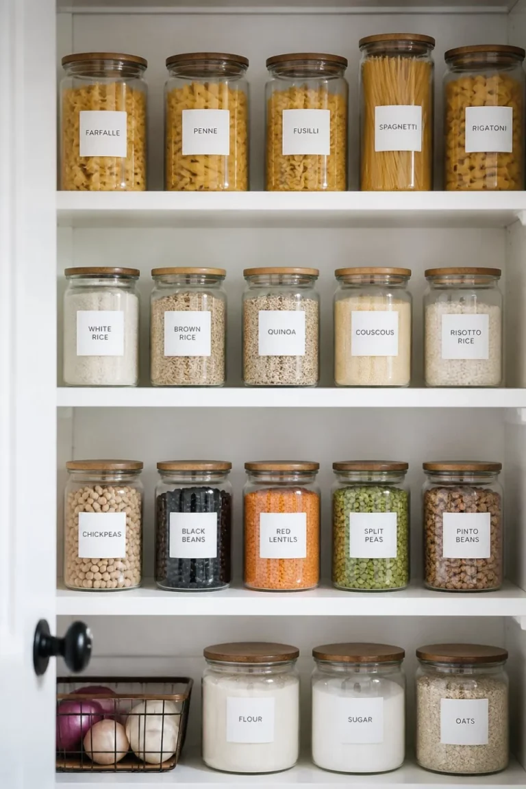
I provide ideas for kitchen organization, décor accents, and functional layouts that make kitchens more beautiful and practical.
The concepts shared here are based on ideas I have personally experimented with or studied through real home décor improvements.