
Colors That Go With Mustard Yellow: 12 Rich Colors
Mustard yellow is a warm, vibrant shade that instantly lifts the mood of any space. I have noticed it brings energy and positivity to interiors while remaining versatile enough to mix with various other colors. By pairing it with the right shades, I have experienced creating balanced, eye-catching color palettes that feel both stylish and inviting. Here, I will share my tested ideas for colors that go with mustard yellow to help you design spaces that truly stand out.
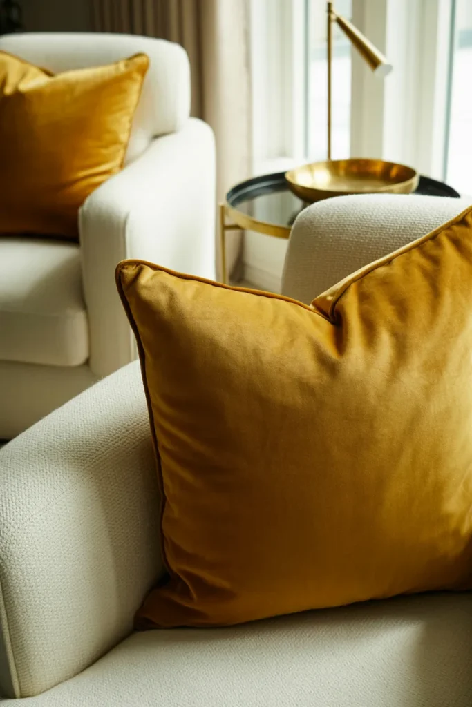
1. White
I have found that combining mustard yellow with white creates a fresh, bright, and joyful atmosphere. I often use mustard yellow bedding with white walls to instantly lift a bedroom’s mood, adding accents of cream or green to balance the look. This pairing works well in living rooms too, where mustard yellow can serve as a bold accent against neutral white backgrounds.
Pro Tip: I recommend using light wooden furniture to complement this scheme and keep the space feeling airy and balanced.
2. Gray
I have tested mustard yellow with gray in many modern interiors, and I noticed gray tones help tone down the intensity while keeping the palette chic. Pairing mustard yellow with light gray creates a bright, subtle contrast, while charcoal gray adds a moody, sophisticated vibe. Either option allows me to maintain a trendy, contemporary feel in the space.
Pro Tip: I suggest adding metallic accents like silver or chrome to elevate this modern color combination.
3. Pink
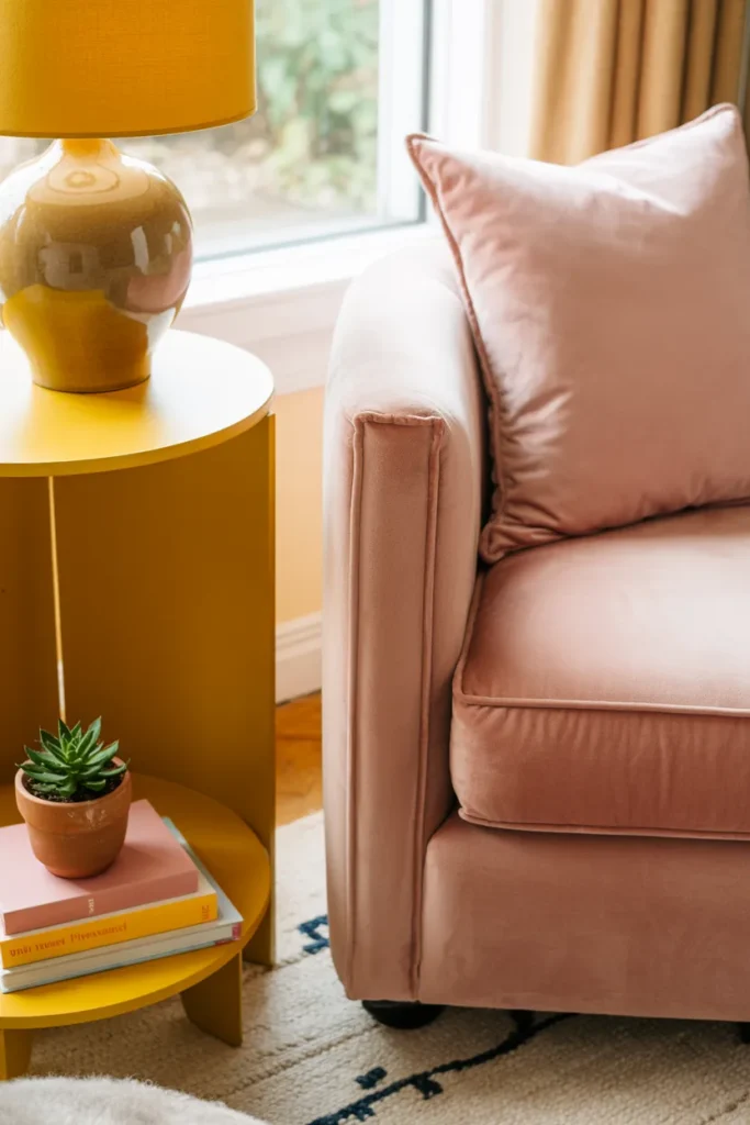
I have experienced that soft pink shades pair beautifully with mustard yellow without overpowering it. Baby pink, coral, and salmon add a playful yet elegant touch, while vibrant pinks can make the palette bold and lively. I often use pink accents to create charming, cheerful interiors that feel approachable and stylish.
Pro Tip: I recommend keeping one dominant color and using pink only for small accents to avoid visual clutter.
4. Cream
I have noticed that cream paired with mustard yellow feels dreamy, sophisticated, and elegant. I often use this combination to soften the boldness of mustard yellow while maintaining a luxurious aesthetic. Adding gold or beige accents alongside cream enhances the richness of this classic pairing.
Pro Tip: I suggest incorporating soft textures like velvet or silk to make this combination feel even more refined.
5. Beige
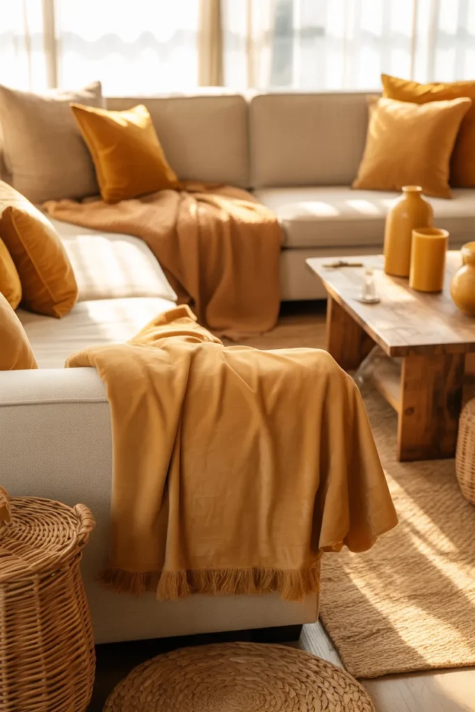
I have observed that beige is a neutral that complements mustard yellow perfectly, creating a bright yet warm space. I often use beige walls or furniture to allow mustard yellow to shine as the main accent. This combination feels effortless, inviting, and versatile for any room style.
Pro Tip: I recommend layering in natural elements like wooden tones or wicker to enhance the cozy vibe.
6. Brown
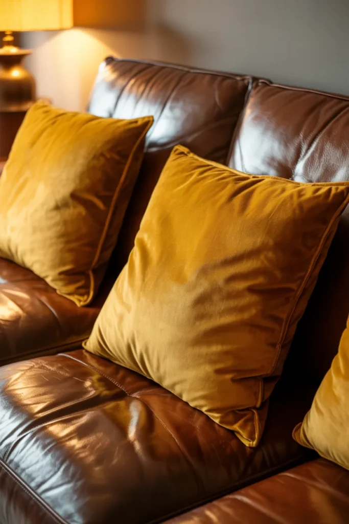
I have found that brown shades work wonderfully with mustard yellow to produce a warm, cozy, and grounded environment. Light brown softens the yellow, while dark brown creates depth and sophistication. I often experiment with furniture or décor in these browns to make mustard yellow truly pop.
Pro Tip: I suggest combining with warm lighting to amplify the inviting atmosphere of this palette.
7. Green
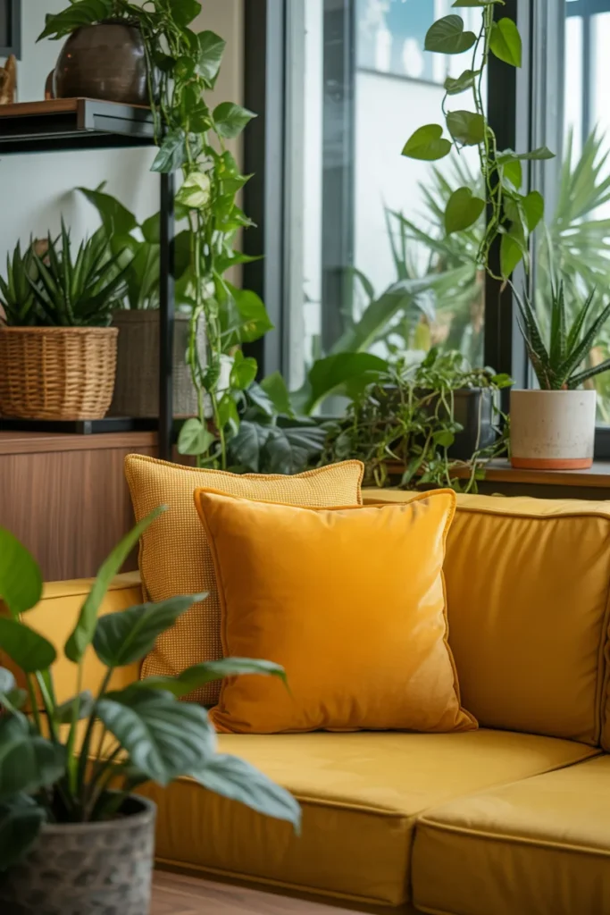
I have tested mustard yellow with green and noticed it instantly brings energy and freshness to any space. Lighter greens create a playful, airy feel, while deeper green tones offer a bold, stylish contrast. I often use plants or green accents to bring this combination to life in living spaces.
Pro Tip: I recommend using small touches of green first and gradually increasing intensity to avoid overwhelming the room.
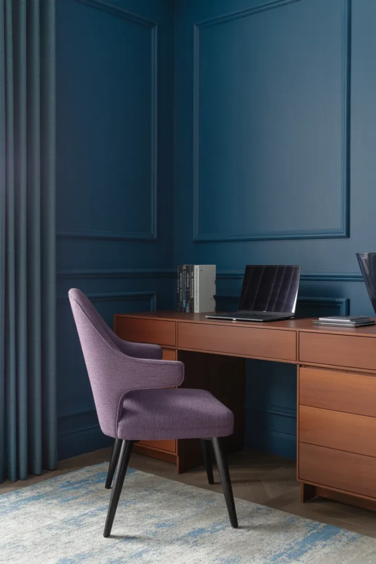
8. Purple
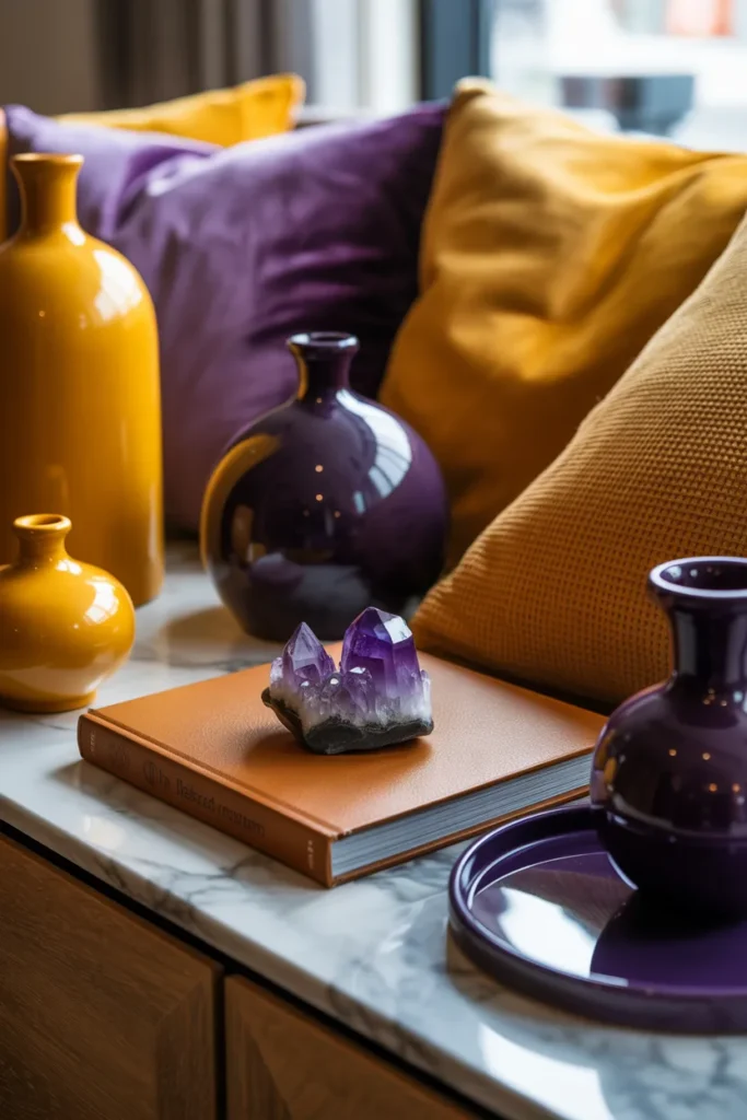
I have experienced that purple shades like lilac, lavender, and plum pair beautifully with mustard yellow. I use them to create a flattering and eye-catching color palette that feels creative yet balanced. Light or dark purples both provide a charming contrast that enhances mustard yellow’s vibrancy.
Pro Tip: I suggest keeping accessories or textiles in purple rather than walls to maintain harmony in the design.
9. Red
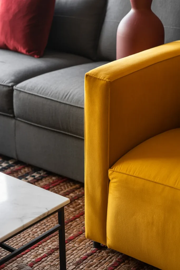
I have noticed that red combined with mustard yellow makes for a bold, powerful, and energetic palette. I often use red in small doses to avoid visual overload while keeping the combination striking. Pairing with neutral tones helps balance this dynamic duo in both décor and artwork.
Pro Tip: I recommend placing red accents strategically in one area, like cushions or vases, to create focus without overwhelming.
10. Navy Blue
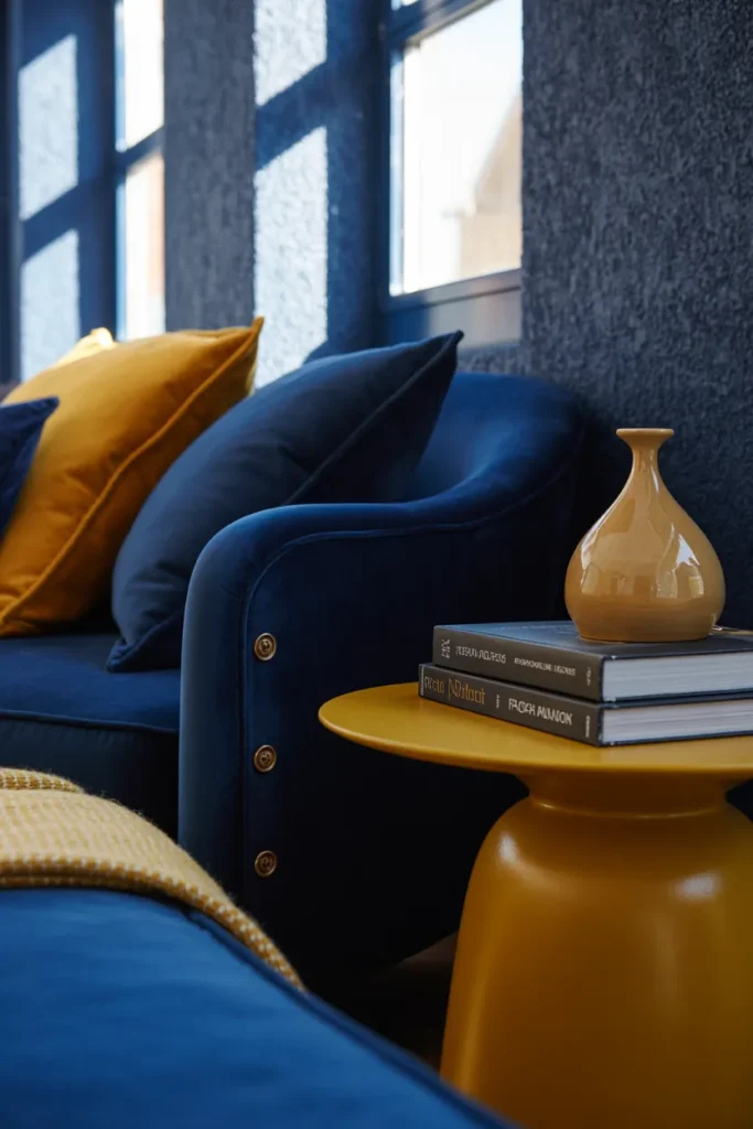
I have observed that navy blue contrasts beautifully with mustard yellow, producing a sophisticated and dramatic effect. I often use navy walls or furniture with mustard accents to create bold, stylish spaces that immediately draw attention. This combination works well in both modern and traditional interiors.
Pro Tip: I suggest incorporating metallic touches like brass or gold to enhance the elegance of this pairing.
11. Orange
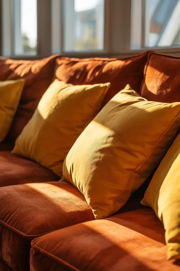
I have found that pairing mustard yellow with orange creates a warm, cheerful, and cozy vibe. Since these colors are similar in tone, I often add a third contrasting color like gray or sky blue to maintain balance. This combination works well in spaces where I want energy without overwhelming the senses.
Pro Tip: I recommend using this duo in textiles like rugs or cushions rather than walls for a subtle, inviting impact.
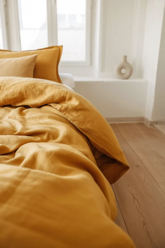
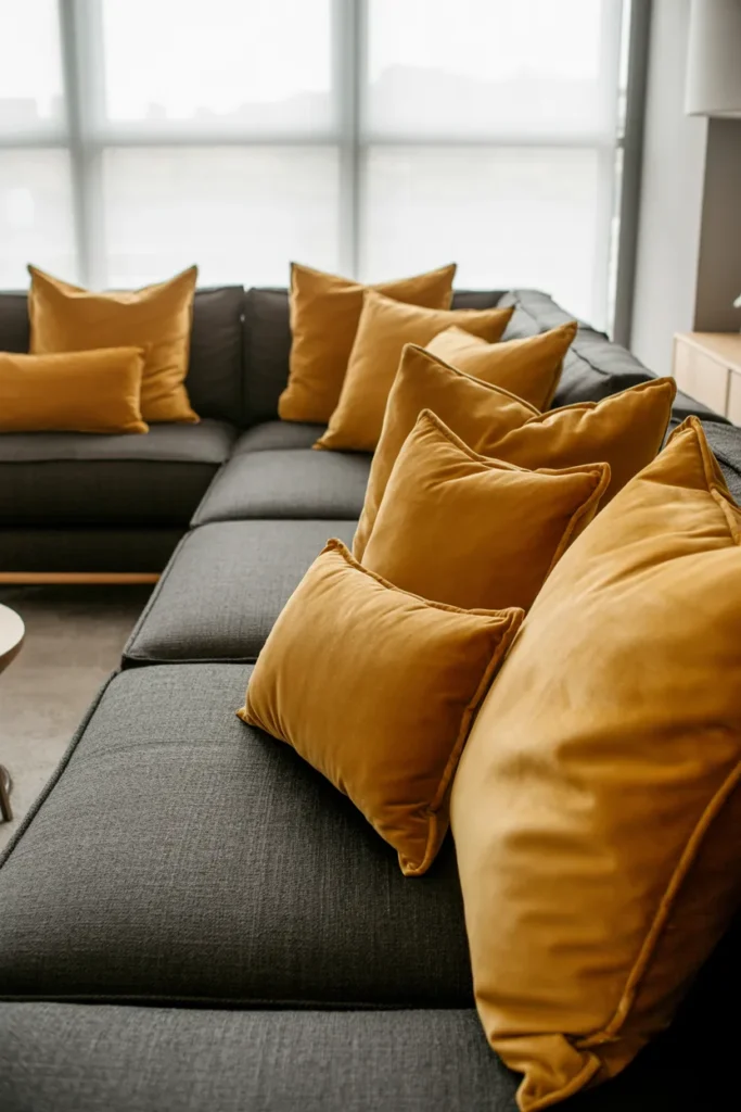
12. Black
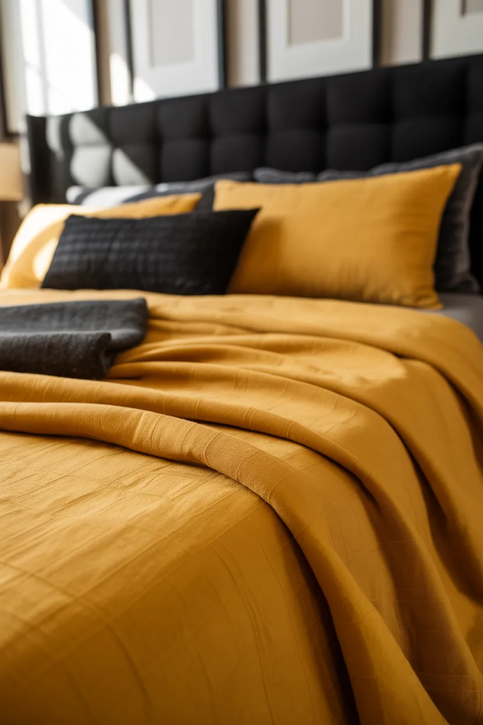
I have found that pairing mustard yellow with black creates a bold, dramatic, and sophisticated look. Black tones down the vibrancy of mustard yellow while adding depth and elegance to any space. I often use mustard yellow bedding with black furniture or accents to create a striking and modern contrast. This combination works beautifully in bedrooms, living rooms, or even office spaces, giving the area a stylish and powerful vibe.
Pro Tip: I recommend using black in moderation alongside mustard yellow to maintain balance; a few key black accents can make the yellow really pop without making the room feel too dark.
Conclusion
I have tried many combinations of colors that go with mustard yellow and found that neutrals like white, cream, beige, or gray help tone it down, while pink or sky blue adds a playful touch. For an energetic and vibrant space, green, orange, and purple work beautifully. Using these pairings, I have consistently created bright, stylish, and visually appealing interiors.
Many of the ideas I share are inspired by real-life experimentation. I often test décor concepts in my own living spaces and explore practical ways they can be applied in everyday homes. I also gather insights from working with homeowners who want to improve the comfort, beauty, and functionality of their spaces.
I share practical ideas for improving living rooms, bedrooms, and overall home aesthetics using simple design principles.
I explore creative ways to upgrade outdoor spaces including patio décor, small backyard styling, and relaxing outdoor setups.
I provide ideas for kitchen organization, décor accents, and functional layouts that make kitchens more beautiful and practical.
The concepts shared here are based on ideas I have personally experimented with or studied through real home décor improvements.