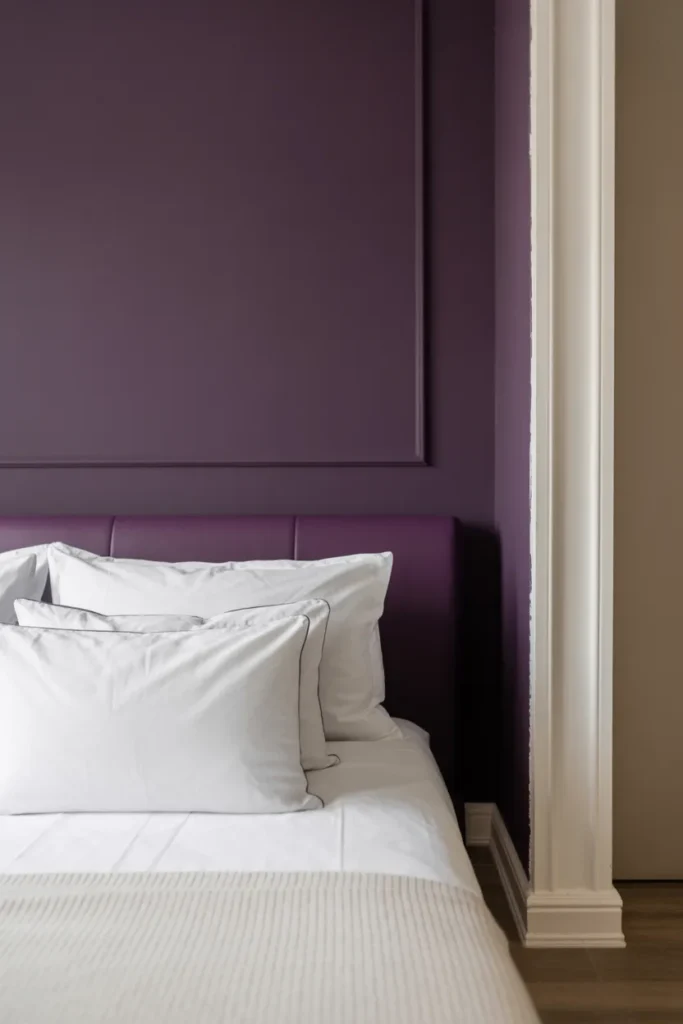
15 Colors That Go With Purple To Elevate Your Home Decor
Purple is one of those colors I’ve always found powerful and expressive. It has long been linked with luxury, creativity, and elegance, which makes it stand out instantly in any space. I have noticed many homeowners hesitate to use it because they think it’s too bold, but I have tested different shades and found it incredibly flexible. From deep tones to soft pastels, I have experienced how the right combination can completely change the mood of a room and make it feel balanced and thoughtfully designed.
I have learned that understanding color pairing really makes a difference when working with purple. I have experimented with different combinations and seen how it can feel cozy, modern, or even dramatic depending on what you pair it with. I recommend exploring different shades and mixes because it allows you to create a space that feels unique and personal while still looking stylish and well put together.
1. Crisp White
I have used crisp white with purple many times, and I find it the easiest way to make purple stand out without overwhelming the space. White keeps everything fresh and clean while allowing purple accents to become the focal point. I have tested this in bedrooms and bathrooms, and it always creates a calm, polished look with a strong visual contrast.
Pro Tip: I recommend using bright white trim with a deep purple wall to create a sharp and modern finish.
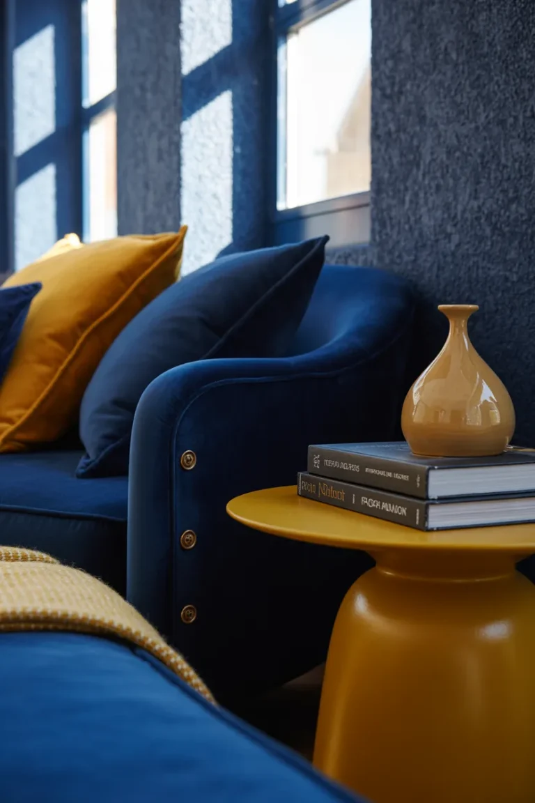
2. Mustard Yellow
I have noticed that mustard yellow adds a bold and energetic touch when paired with purple. Since they sit opposite on the color wheel, I have seen how they naturally enhance each other’s intensity. I recommend using muted mustard tones because I have tested brighter yellows and they can feel too harsh, while softer shades create a more stylish and balanced look.
Pro Tip: I suggest pairing plum tones with mustard accents like cushions or chairs for a warm, retro-inspired vibe.
3. Charcoal Grey
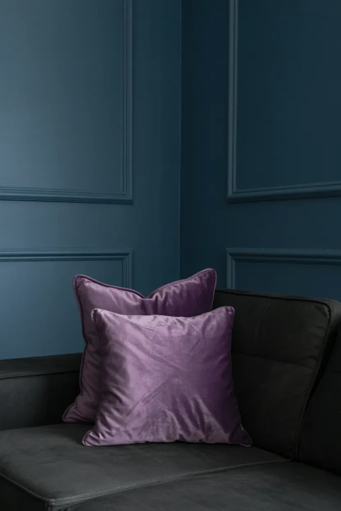
I have experienced that charcoal grey tones down the intensity of purple and gives the room a more grounded and cozy feel. It works especially well when I want a deeper, more relaxed atmosphere without losing sophistication. I have used this pairing in media spaces and noticed it adds a calm and modern touch.
Pro Tip: I recommend adding layered lighting to keep the room from feeling too dark.
4. Emerald Green
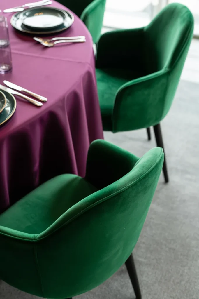
I have tested emerald green with purple and found it creates a rich, luxurious look inspired by nature. When both colors are deep and vibrant, I have noticed they complement each other beautifully without clashing. This pairing always feels elegant and bold at the same time.
Pro Tip: I suggest keeping both colors at similar intensity levels so one doesn’t overpower the other.
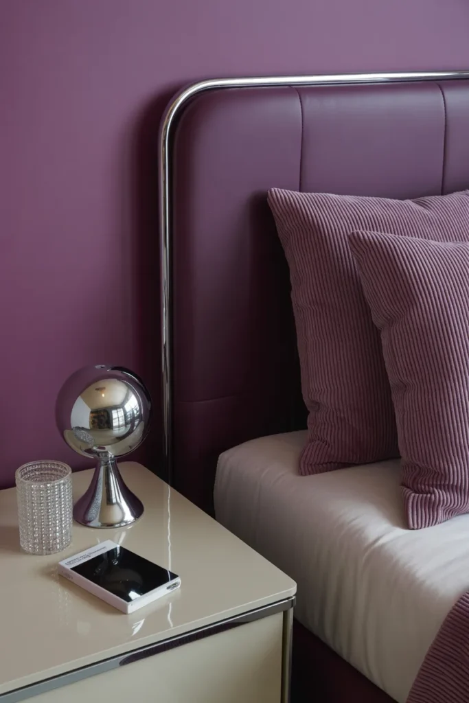
5. Blush Pink
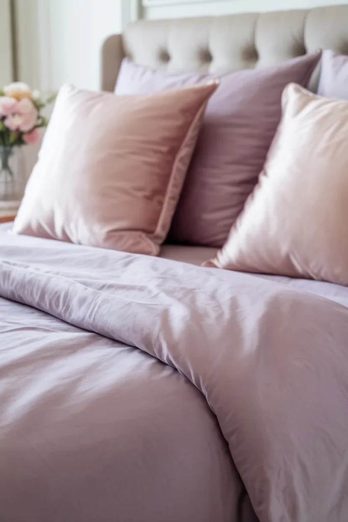
I have used blush pink with purple when I wanted a softer and more romantic feel. Since these colors are close on the color wheel, I have experienced how naturally they blend together. This combination feels calm, gentle, and visually pleasing in both adult and playful spaces.
Pro Tip: I recommend adding subtle metallic accents like rose gold to enhance the softness.
6. Gold
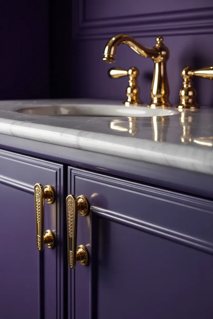
I have noticed that gold instantly elevates purple and makes the space feel luxurious. I have tried this combination in small areas and found it adds a rich and elegant touch without needing too many elements. Using gold carefully keeps the look refined instead of overwhelming.
Pro Tip: I recommend using gold in small details like fixtures or frames for a balanced, upscale feel.
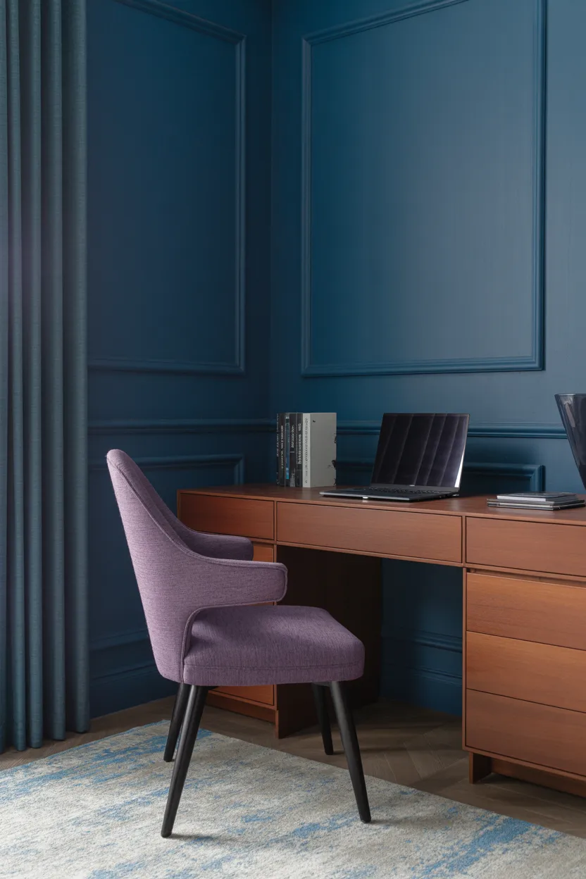
7. Navy Blue

I have experimented with navy blue and purple and found they create a deep and calming atmosphere together. Because they share similar undertones, I have seen how smoothly they blend into a cohesive look. This pairing feels refined and slightly dramatic in the best way.
Pro Tip: I suggest mixing textures like velvet or wool to add depth and avoid a flat look.
8. Sage Green
I have experienced that sage green softens purple and brings a natural, calming feel into the space. When paired with lighter purples, I have seen it create a fresh and airy environment that feels relaxing and welcoming. It works especially well in bright, open areas.
Pro Tip: I recommend using natural materials like wood to enhance the organic vibe.
9. Teal
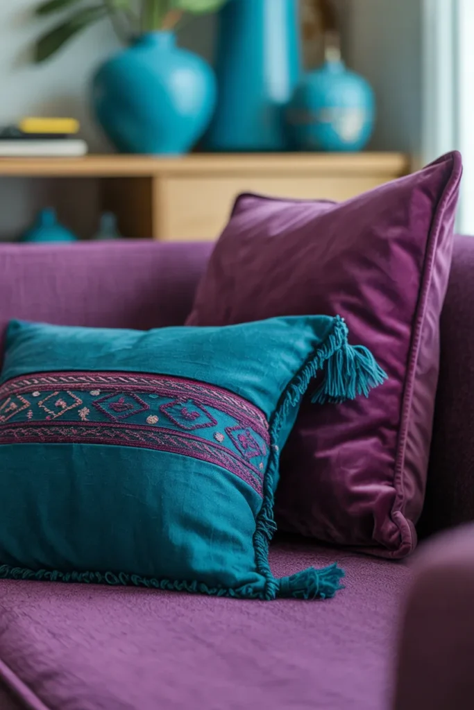
I have tested teal with purple in more creative spaces and noticed it adds energy and personality. The mix of blue and green in teal creates a lively contrast while still coordinating well with purple. This pairing feels bold but still harmonious.
Pro Tip: I suggest starting with accessories like rugs or decor pieces if you want to try this combo without committing fully.
10. Cream and Beige
I have found that cream and beige tones make purple feel softer and more inviting. They reduce the intensity and give the space a warmer, more comfortable look. I have used this combination in traditional settings and it always feels timeless and balanced.
Pro Tip: I recommend choosing warm undertones to balance the coolness of purple.
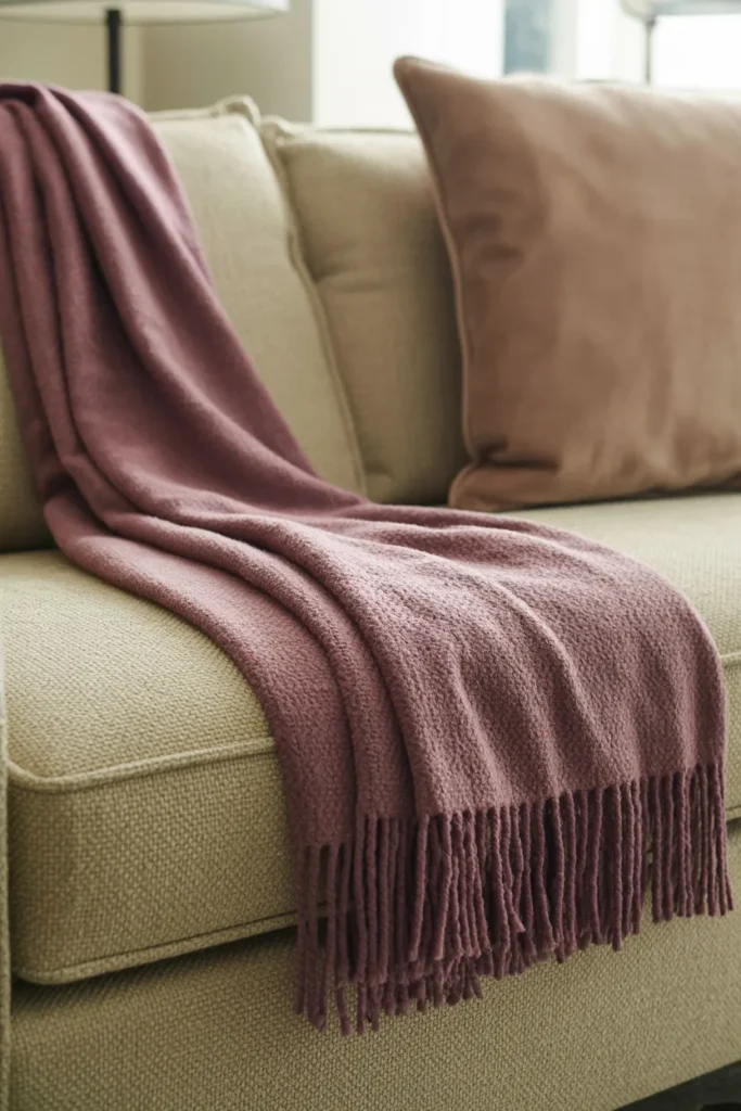
11. Burnt Orange
I have noticed that burnt orange brings warmth and richness when combined with purple. I have seen this pairing create a cozy and slightly vintage feel that works well in relaxed spaces. The contrast between warm and cool tones adds visual interest.
Pro Tip: I suggest using earthy shades like terracotta to keep the look grounded.
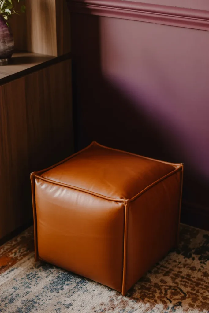
12. Chocolate Brown
I have used chocolate brown with purple to create a deep and cozy atmosphere. This combination feels stable and comforting, especially when darker tones are used. I have experienced how rich wood or leather textures enhance the overall look.
Pro Tip: I recommend sticking to deep brown shades to maintain a strong contrast.
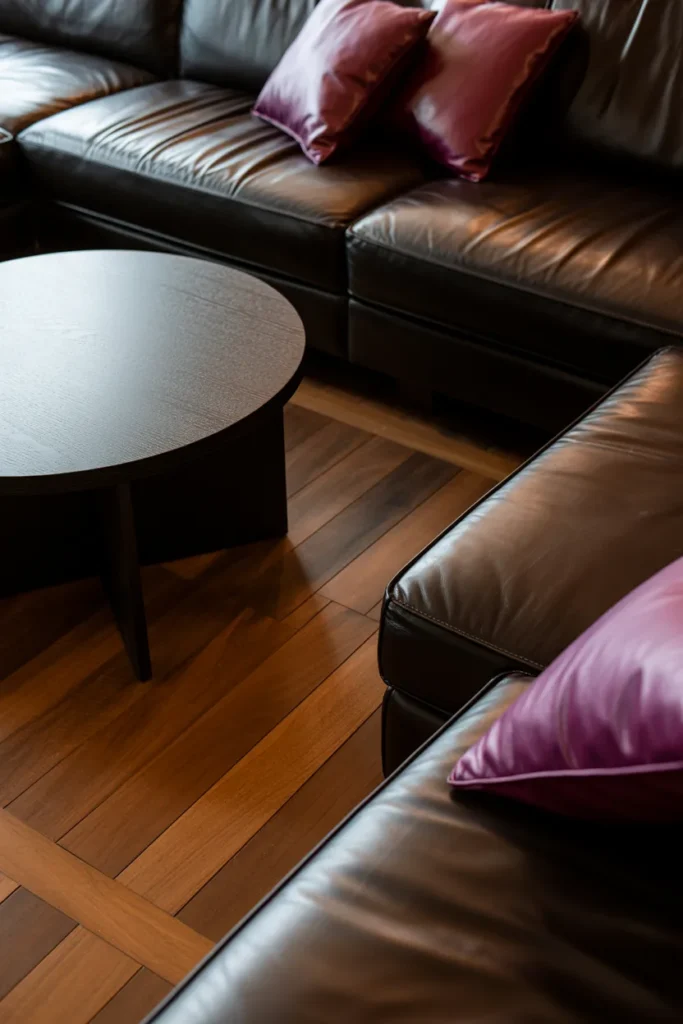
13. Matte Black
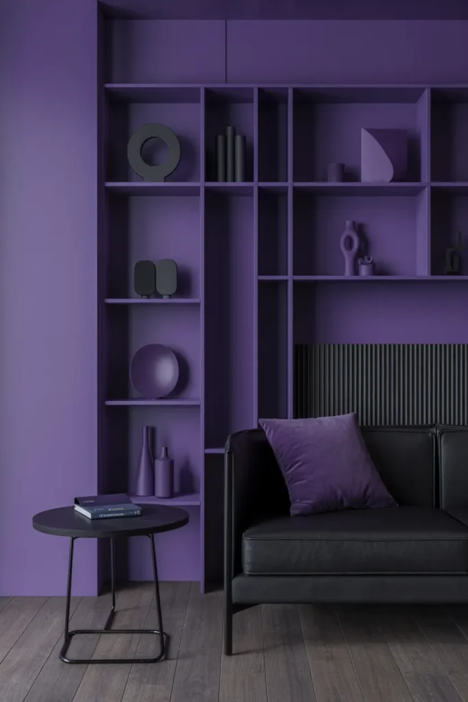
I have tested matte black with purple and found it creates a bold and modern statement. Black sharpens the appearance of purple and gives it a more striking edge. This pairing feels dramatic and confident in contemporary spaces.
Pro Tip: I suggest balancing it with lighting to keep the space from feeling too heavy.
14. Silver and Chrome
I have noticed that silver and chrome highlight the cooler side of purple, giving it a sleek and polished look. I have used reflective surfaces and found they help brighten darker shades of purple while adding a touch of elegance.
Pro Tip: I recommend using mirrored or metallic finishes to reflect light and enhance the space.
15. Mint Green
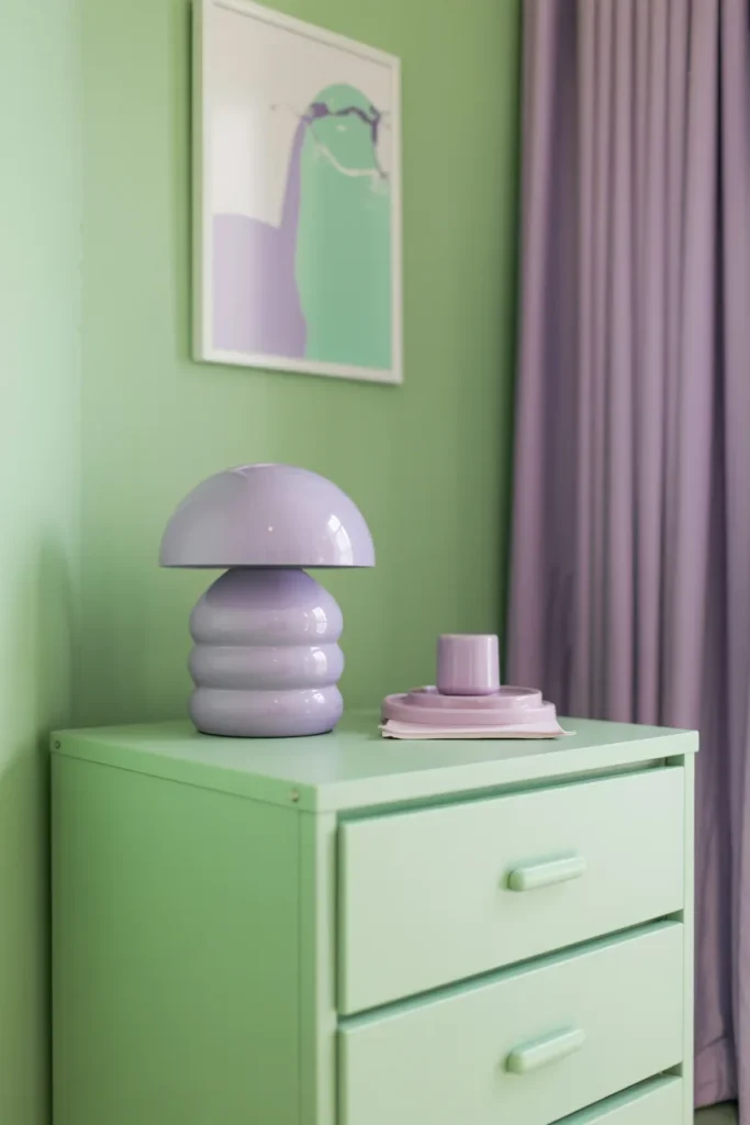
I have experienced that mint green paired with lavender creates a fresh and playful atmosphere. This combination feels light, airy, and modern, especially in pastel-themed interiors. It adds a cheerful and relaxed vibe to any room.
Pro Tip: I suggest using this pairing in smaller spaces or accents for a subtle yet refreshing look.
Conclusion
I have worked with purple in different styles and I can say it’s much easier to use than most people think. Whether I go with soft neutrals or bold contrasts, I have seen how purple adapts beautifully. I recommend trying different combinations to find what suits your space best, because with the right pairing, it can transform any room into something stylish and personal.
Many of the ideas I share are inspired by real-life experimentation. I often test décor concepts in my own living spaces and explore practical ways they can be applied in everyday homes. I also gather insights from working with homeowners who want to improve the comfort, beauty, and functionality of their spaces.
I share practical ideas for improving living rooms, bedrooms, and overall home aesthetics using simple design principles.
I explore creative ways to upgrade outdoor spaces including patio décor, small backyard styling, and relaxing outdoor setups.
I provide ideas for kitchen organization, décor accents, and functional layouts that make kitchens more beautiful and practical.
The concepts shared here are based on ideas I have personally experimented with or studied through real home décor improvements.