
45 Colorful Kitchen Ideas that Will Add Burst of Color

I’ve always felt that a kitchen can handle more personality than most people expect. Color can come through cabinets, walls, tile, countertops, furniture, lighting, or even a small island, so I don’t think you need to repaint the whole room to make a noticeable change. In these 45 colorful kitchen ideas, I’ve included bright cabinet combinations, colorful backsplashes, retro kitchens, two-tone schemes, warm wood pairings, bold islands, and softer color choices. I’d use the ideas that fit the amount of color I’m comfortable living with rather than trying to copy an entire look.
Key Takeaways
- I can add color through one feature or combine several shades for a stronger look.
- I find white, wood, black, and other neutrals useful for keeping bright colors balanced.
- I’d test paint and tile samples in the actual kitchen because natural and artificial light can change how colors appear.
- I can use a colorful island, backsplash, or accessories if full-color cabinets feel like too much.
- I’d repeat one or two accent colors in small details so the kitchen feels connected rather than random.
1. Yellow Cabinets And Blue Countertops

I like yellow cabinets with blue countertops when I want the kitchen to feel cheerful without relying on a lot of decoration. The blue gives the bright yellow somewhere to settle, while wood or neutral flooring can keep the combination from feeling too busy. This pairing works especially well when the cabinet design stays fairly simple.
Pro Tip: I’d choose a softer blue if the yellow is very bright, because slightly muted shades are easier to live with across a large kitchen.
2. Lime Green with A Colorful Backsplash

I’d use lime green carefully because it is naturally strong, but it can look great when the backsplash carries several related colors. Instead of adding another large competing shade, I’d keep the countertops and larger appliances simple. A few vintage-style details can also make the green feel intentional.
Design Insight: Bright green reflects plenty of light, so I’d check a paint sample during both daytime and evening before committing.
3. Turquoise with Sleek Retro Cabinetry
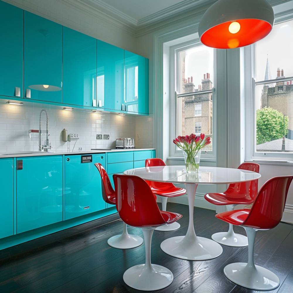
I like turquoise for a kitchen with a playful retro direction, especially when the cabinet shapes are clean and uncomplicated. White furniture can break up the color, while small red or warm-toned accents can add contrast. The result can feel colorful without needing patterned finishes everywhere.
Pro Tip: I’d repeat turquoise in only a few accessories if the cabinets already carry most of the color.
4. Emerald with A Gold Backsplash and Countertops

Emerald green has enough depth to work in a more sophisticated kitchen, and warm metallic details can make it feel richer. I’d pair it with simple cabinet hardware and avoid adding too many decorative colors. Cream, warm white, or natural wood can also soften the overall combination.
Design Insight: Darker green can make a kitchen feel more enclosed, so I’d use good task lighting under cabinets and around food-preparation areas.
5. Yellow with Black Countertops

I think yellow cabinets become much easier to balance when they are paired with black countertops. The dark surface creates a clear visual break and gives the bright cabinets a stronger outline. Natural wood is another useful addition because it adds warmth without introducing another loud color.
Pro Tip: I’d keep the backsplash fairly quiet when both the cabinets and countertops already provide strong contrast.
6. Pink and White Cabinetry

I’d choose pink and white cabinetry when I want color without making the whole kitchen feel heavy. White can cover the larger visual areas while pink becomes the personality color. Brass or brushed metal hardware can add warmth without competing with the cabinetry.
Design Insight: Soft pink usually feels easier to use over a large cabinet run than highly saturated pink, especially in an open-plan kitchen.
7. Mint Cabinetry and Gold Handles

Mint is one of the easier colorful cabinet shades to work with because it has a light, fresh appearance. I like the idea of pairing it with warm gold hardware and a patterned backsplash, but I’d let one pattern lead rather than using several competing prints. Copper lighting can also connect nicely with the warmer metal finishes.
Pro Tip: I’d compare the mint cabinet sample beside the backsplash tile before ordering because undertones can make two colors look surprisingly different.
8. Red and White

Red can make a kitchen feel energetic very quickly, so I’d use white to give the eyes a place to rest. Red tile, furniture, or selected cabinetry can provide enough impact without covering every surface. Stainless steel appliances can also work well because they introduce a neutral metallic finish.
Design Insight: If bright red cabinets feel too permanent, I’d bring red in through stools, curtains, art, or a small appliance first.
9. Yellow Walls and Blue Cabinets

I like this combination for a kitchen where the goal is clearly cheerful and colorful. Blue cabinetry can ground the room while yellow walls provide warmth above it. Wooden countertops or shelves can bridge the two colors and keep the room from feeling overly cool.
Pro Tip: I’d use a warmer wood tone when the blue feels cool because natural wood can make the color combination feel more balanced.
10. Vintage with Green Walls

Green walls can give a vintage kitchen plenty of character, especially when mixed with colorful furniture and older-style details. I’d keep the main cabinet finish relatively simple if the walls, island, and accessories are already colorful. This approach lets each feature show without making the kitchen look cluttered.
Design Insight: Vintage-inspired colors often work best when their saturation is slightly softened rather than extremely bright.
11. Curved Kitchen with Red Walls
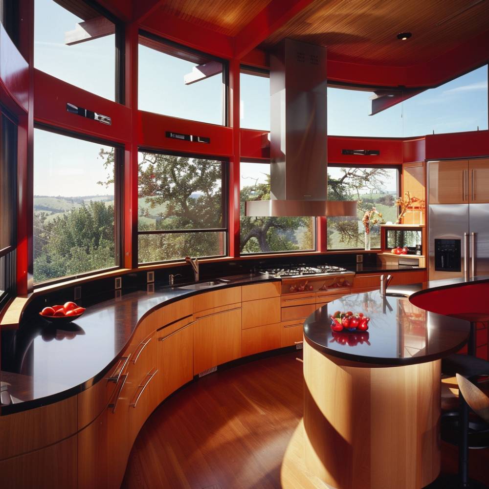
I like red walls in a kitchen with curved cabinetry because the architectural shape already creates visual interest. Wooden cabinets and dark countertops can keep the red from dominating every surface. I’d also make sure the room has enough lighting so the wall color does not make the space feel darker than expected.
Pro Tip: I’d use red on one major wall or zone when the kitchen already has strong cabinetry and architectural features.
12. Blue with A Tiled Backsplash

Blue cabinets can become the main color story while a patterned backsplash adds a second layer of interest. I’d choose accessories in one or two colors pulled directly from the tile instead of introducing unrelated shades. This makes the kitchen feel coordinated without making everything match exactly.
Design Insight: Patterned tile works especially well when at least one color in the pattern repeats elsewhere in the room.
13. Purple Cabinets and Pink Appliances

I’d consider purple and pink when I want a genuine retro or playful kitchen rather than a restrained design. Gold hardware can warm the combination, while open shelving gives the room space for a few carefully chosen objects. Because both colors are strong, I’d keep the countertops and larger surfaces relatively calm.
Pro Tip: I’d use a sample board with the purple, pink, countertop, and hardware together before making the final choice.
14. Glossy Blue Backsplash

A glossy blue backsplash is an easy way to add color without replacing the cabinets. I like this approach for a mostly white kitchen because the backsplash becomes the main visual feature. The reflective surface can also bounce light around the room, although it will show splashes and marks more readily.
Design Insight: Glossy tile is practical around areas that need regular wiping, but I’d choose a grout color that does not make everyday cleaning look obvious.
15. Fuchsia Backsplash

Fuchsia can bring a strong focal point to an otherwise neutral kitchen. I’d pair it with tan, white, gray, or stainless steel rather than adding another intense color beside it. This is one of the ideas I’d consider when I want a colorful kitchen without painting the cabinetry.
Pro Tip: A bold backsplash is easier to change later than full cabinetry, so it can be a useful way to test whether I enjoy strong color long term.
16. Navy Cabinets and A Bold Yellow Backsplash

Navy and yellow create strong contrast, but the deep blue helps control the brightness of the yellow. I like adding natural wood or simple white surfaces to connect the two colors. This combination can work in traditional, country, or more modern kitchens depending on the hardware and cabinet style.
Design Insight: Navy absorbs more visual light than pale colors, so I’d pay attention to ceiling fixtures and under-cabinet lighting.
17. Green and Wood Cabinets

I like green and natural wood together because the wood provides warmth while the green supplies color. This is a good option when I want a colorful kitchen that still feels connected to natural materials. White or stainless steel appliances can keep the room from becoming too visually dense.
Pro Tip: I’d let the wood grain remain visible rather than adding another strong pattern, especially when the green cabinetry is already prominent.
18. Blue with Terracotta Tile Floor

Blue cabinetry paired with terracotta flooring creates a warm and slightly Mediterranean feel. I’d use natural wood countertops or shelves to connect the cool blue with the earthy floor. A patterned ceiling or backsplash can work, but I’d keep the pattern controlled so the floor remains part of the main design.
Design Insight: Terracotta has warm orange undertones, so blue shades with a little warmth usually sit more comfortably beside it.
19. Bold Red and Black

Red and black create one of the strongest combinations on this list, so I’d use them deliberately. A black countertop or backsplash can give bright red cabinetry a clean boundary, while wood can soften the overall effect. Stainless steel appliances also fit naturally into this palette.
Pro Tip: I’d avoid adding several extra accent colors because red and black already provide plenty of contrast.
20. Turquoise and White

Turquoise and white are a good match for a bright kitchen, particularly when I want a relaxed coastal or beach-house feel. A small amount of yellow can add warmth, while natural wood keeps the room from looking too cold. White also gives turquoise more visual space to stand out.
Design Insight: In a small kitchen, using white on upper surfaces can help keep a strong turquoise lower section from visually closing in the room.
21. Lime with Neon Green Cabinetry

This is one of the boldest options, and I’d use it only when I genuinely enjoy high-energy color. White countertops and simple flooring can provide the contrast needed to make neon green look intentional. I’d keep the cabinet hardware and furniture straightforward rather than adding more visual noise.
Pro Tip: I’d test neon shades under the kitchen’s actual lighting because artificial light can make them appear much stronger.
22. Lemon Yellow and Brown Cabinets

Lemon yellow becomes warmer and more grounded when combined with brown cabinetry. I like using this type of palette when I want a colorful kitchen with a slightly retro feel. A purple or blue accent can work, but I’d keep it limited to the backsplash or accessories.
Design Insight: Brown wood finishes can reduce the sharpness of very bright yellow, making the overall palette feel more comfortable.
23. Bright Red Cabinets

Bright red cabinetry makes the cabinets the main event, so I’d avoid adding too many other large color blocks. A patterned floor can work if its colors are carefully coordinated, while simple hardware can keep the cabinet design clean. This approach suits homeowners who are comfortable making a strong design choice.
Pro Tip: I’d order a cabinet door sample in the actual red before committing because glossy, matte, and satin finishes can change how intense the color appears.
24. Teal Cabinets
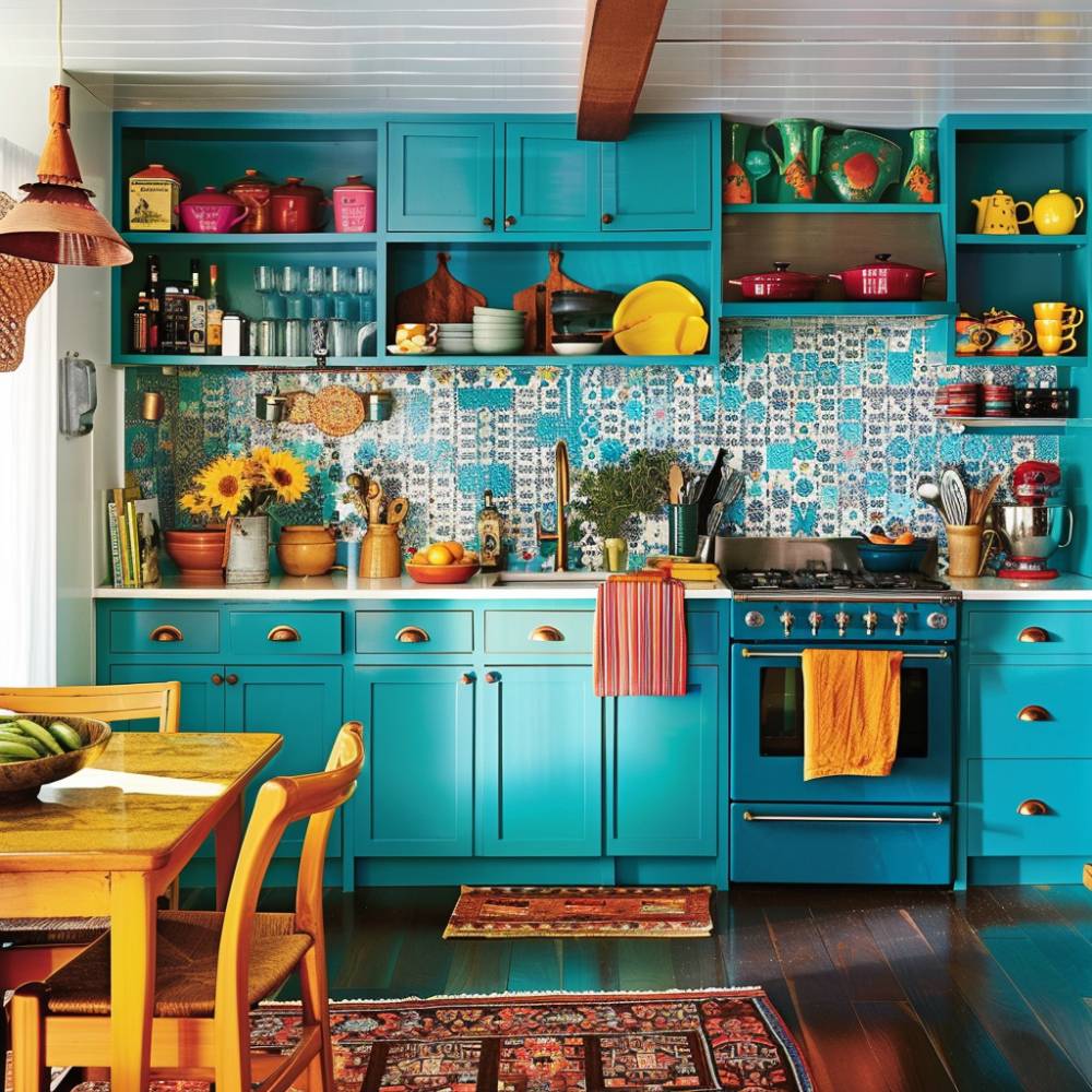
Teal is useful when I want something stronger than traditional blue but softer than some neon shades. I’d pair it with a mixed-color backsplash and repeat one of those accent shades in towels, artwork, or seating. Neutral countertops can keep the composition balanced.
Design Insight: Teal contains both blue and green, so I’d check whether its undertone works with the existing flooring and wood finishes.
25. Bold Yellow Kitchen Island

A yellow island is one of my favorite ways to introduce color without repainting the entire kitchen. White cabinetry can stay neutral while the island becomes the focal point. A colorful backsplash can add more personality, but I’d make sure it includes a shade that connects with the island.
Pro Tip: I’d use the island color again in one or two small details so it feels like part of the overall palette rather than an isolated feature.
26. Emerald with A White Subway Tile Backsplash
Emerald cabinetry already provides plenty of depth, and white subway tile gives it a clean backdrop. I like adding warm hardware or a colorful runner because those details can soften the contrast. This combination can work in both traditional and modern kitchens depending on the cabinet profile.
Design Insight: A simple white tile is useful when I want colorful cabinets to remain the focus instead of competing with a complex backsplash.
27. Yellow Walls and Powder Blue Cabinets
Powder blue and yellow create a softer version of a colorful kitchen. I’d use the blue on cabinetry and yellow on the walls, then bring in small amounts of pink or green through tile, furniture, or accessories. The lighter shades make the combination feel playful without being as intense as neon colors.
Pro Tip: I’d use warm white rather than stark blue-white lighting if I want the pastel colors to feel softer in the evening.
28. Red Cabinetry and A Tile Backsplash

Red cabinets can work with a patterned backsplash when the tile contains some neutral space. I’d let the backsplash add detail without trying to compete with the cabinet color. Stainless steel appliances and simple countertops can help keep the kitchen practical and visually balanced.
Design Insight: When both cabinetry and backsplash are patterned or colorful, I’d use plain flooring to give the eye a quiet surface.
29. Lime Green Walls and Dark Grey Cabinets

Lime green walls can feel much more controlled when paired with dark gray cabinetry. The gray absorbs some of the brightness while still allowing the green to stand out. I’d add white countertops or lighter flooring if the kitchen needs more visual brightness.
Pro Tip: I’d use the strongest green on the wall that receives the best natural light if I want the color to feel lively rather than heavy.
30. Vintage Yellow Touches

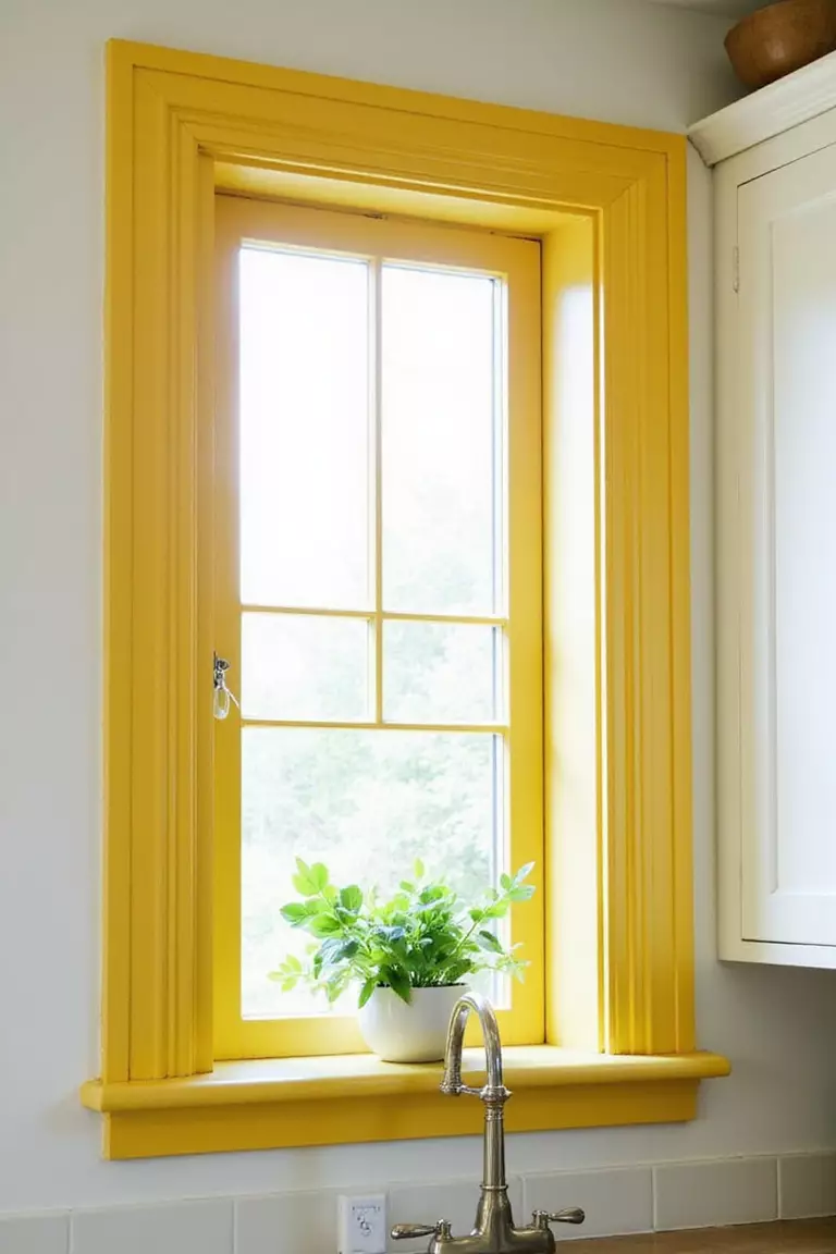
I don’t always need colorful cabinets to create a colorful kitchen. Yellow stools, lighting, dishes, curtains, or small appliances can add a vintage feel while keeping the main cabinetry neutral. This is also an easier approach if I expect to change my style later.
Design Insight: Repeating one accent color across several small items usually looks more intentional than placing one bright object in an otherwise neutral room.
31. Bold Red with A Blue Patterned Tile Wall

Red and blue can create a classic high-contrast kitchen when one color is dominant and the other is used as an accent. I’d let the patterned tile provide the connection between the shades instead of adding several unrelated colors. Wood and brass can add warmth where needed.
Pro Tip: I’d choose the backsplash first if it has several colors, then pull the cabinet color from one of its stronger tones.
32. Retro Blue with Orange Stools

Blue cabinetry with orange seating has a clear retro feel, and I like that the orange can stay limited to movable furniture. Colorful dishes and small accessories can support the look without making permanent changes. This is a practical approach for renters or anyone who likes changing decor.
Design Insight: Orange sits opposite blue on the traditional color wheel, which is why the pairing creates noticeable contrast.
33. Green with A Matching Kitchen Island

Matching green cabinets and an island can create a strong, unified kitchen. I’d use butcher-block or another warm wood surface to break up the color and add practical warmth. Small red or yellow accessories can provide contrast without taking over the room.
Pro Tip: If I use the same green across multiple cabinet sections, I’d vary the texture through wood, tile, or hardware rather than adding another major color.
34. Lemon Yellow with Concrete Floor

Lemon yellow cabinetry can look surprisingly modern when placed against a simple concrete floor. The neutral floor gives the bright cabinets room to stand out while keeping the kitchen from feeling overly decorative. Large white tiles can add another clean surface to balance the color.
Design Insight: Concrete is visually neutral, so it works well when I want the cabinetry to carry most of the room’s color.
35. Teal with White Countertops

Teal cabinetry and white countertops create a clean contrast that works particularly well in smaller kitchens. I’d add a patterned rug or colorful light fixture if I want more personality, but I’d avoid making every accessory colorful. The white countertop also keeps the work area visually bright.
Pro Tip: I’d choose a washable kitchen runner if I’m adding pattern near the sink or cooking zone because those areas see more spills and foot traffic.
36. Bold Red with Neutral Backsplashes

A neutral backsplash is a smart partner for bold red cabinets because it gives the eye a break. I’d use lighting to highlight the cabinet color rather than adding more decorative finishes. Warm white walls, stone, or simple tile can all work well here.
Design Insight: A neutral backsplash does not have to be plain; subtle texture can add interest without competing with strong cabinetry.
37. Bright Green with Bold Cabinetry

Bright green cabinets can make a kitchen feel fresh and energetic, especially when paired with simple stainless steel appliances. I’d keep the surrounding finishes fairly restrained so the cabinet color remains the main feature. Natural wood can also make the green feel less stark.
Pro Tip: I’d choose cabinet hardware with a simple shape because highly decorative hardware can make an already colorful cabinet look busier.
38. Colorful with Orange Cabinets

Orange cabinetry is a confident choice, particularly when combined with colorful tile, green walls, and patterned furniture. I’d use this kind of layered palette only if I enjoy a more collected and eclectic look. Keeping the countertop material visually simple can help all the colors work together.
Design Insight: When several strong colors are used, repeating each color at least once in a smaller detail can make the palette feel planned.
39. Minimalist Blue and Red

I like this idea because it proves that a colorful kitchen does not have to be cluttered. Blue cabinetry can provide the base, while a red island becomes the focal point and mint tile adds a softer supporting shade. Wood countertops help connect the different colors.
Pro Tip: I’d keep open shelving and countertop decor limited in a multicolor kitchen so the color scheme remains easy to read.
40. Pink Kitchen Island

A pink island can give a neutral or darker kitchen a clear focal point. I like pairing it with black lower cabinets and a green backsplash when the goal is a more playful design. The trick is to make one feature dominant and let the other colors support it.
Design Insight: Painting only the island is often less expensive and less disruptive than replacing or repainting an entire cabinet run.
41. Green Cabinets and Orange Tile Backsplash

Green cabinets with orange tile create a warm, playful combination that works especially well with natural wood shelving. I’d keep the tile pattern consistent and use orange in only a few accessories outside the backsplash. This gives the kitchen character without adding too many unrelated colors.
Pro Tip: I’d bring a cabinet sample to the tile showroom rather than relying on phone photos when matching green and orange finishes.
42. Orange Printed Tile Backsplash

An orange printed backsplash can provide plenty of personality while gray cabinets keep the room grounded. A mint refrigerator or colorful rug can add another layer, but I’d make sure those accents connect to colors already present in the tile. This approach is useful when I want the backsplash to be the main decorative feature.
Design Insight: Busy tile patterns are easier to live with when larger surfaces around them remain relatively simple.
43. Blue Bold Wallpaper Ceiling

I like the idea of using the ceiling as a color surface because it leaves the cabinets and counters available for simpler finishes. A blue wallpaper or painted ceiling can give a kitchen a coastal or vintage feel without covering the walls. I’d make sure the ceiling pattern works with the backsplash rather than competing with it.
Pro Tip: I’d use a washable or kitchen-suitable finish where possible because cooking creates moisture, grease, and airborne residue.
44. Colorful Boho Touches

A boho kitchen can use color through wallpaper, textiles, wood, pottery, rugs, and small decorative pieces instead of relying entirely on bright cabinetry. I like this approach because I can change individual elements as my taste changes. Warm brown furniture can provide a useful base for reds, greens, and other richer shades.
Design Insight: Mixing patterns works better when the patterns share at least one or two colors, even if their shapes and scales are different.
45. Green and Blue Cabinets

Green and blue cabinetry can give a kitchen a layered vintage appearance, especially when a warm yellow hood or orange chair adds contrast. I’d let the cabinetry provide the main color story and use the warmer accents sparingly. This palette works particularly well when the goal is a kitchen that feels collected rather than perfectly matched.
Pro Tip: I’d repeat the warm accent color in two or three small places so the yellow or orange does not look disconnected from the rest of the room.
Conclusion
I don’t think a colorful kitchen has to mean using bright colors everywhere. From the ideas above, I can add personality with one yellow island, a blue backsplash, green cabinets, colorful furniture, or a combination of several shades. My main advice is to decide which feature should get the most attention first, then use neutral materials, natural wood, or repeated accent colors to keep everything connected. A kitchen should still be practical to use every day, so I’d always consider cleaning, lighting, durability, and how the colors look at different times of day before making permanent changes.
Many of the ideas I share are inspired by real-life experimentation. I often test décor concepts in my own living spaces and explore practical ways they can be applied in everyday homes. I also gather insights from working with homeowners who want to improve the comfort, beauty, and functionality of their spaces.
I share practical ideas for improving living rooms, bedrooms, and overall home aesthetics using simple design principles.
I explore creative ways to upgrade outdoor spaces including patio décor, small backyard styling, and relaxing outdoor setups.
I provide ideas for kitchen organization, décor accents, and functional layouts that make kitchens more beautiful and practical.
The concepts shared here are based on ideas I have personally experimented with or studied through real home décor improvements.